 Glimmer DSL for Tk 0.0.63
Ruby Tk Desktop Development GUI Library

Glimmer DSL for Tk enables desktop development with Glimmer in Ruby.
Tcl/Tk has recently improved by gaining native looking themed widgets on Mac, Windows, and Linux in Tk version 8.5. Additionally, Ruby 3.0 Ractor (formerly known as Guilds) supports truly parallel multi-threading, making both MRI and Tk finally viable for support in Glimmer (Ruby Desktop Development GUI Library) as an alternative to JRuby on SWT.
The trade-off is that while SWT provides a plethora of high quality reusable widgets for the Enterprise (such as Nebula), Tk has a very fast app startup time and a small memory footprint courtesy of MRI Ruby.
Glimmer DSL for Tk aims to provide a DSL similar to the Glimmer DSL for SWT to enable more productive desktop development in Ruby with:
- Declarative DSL syntax that visually maps to the GUI widget hierarchy
- Convention over configuration via smart defaults and automation of low-level details
- Requiring the least amount of syntax possible to build GUI
- Bidirectional Data-Binding to declaratively wire and automatically synchronize GUI with Business Models
- (Future Plan) Custom Widget support
- (Future Plan) Scaffolding for new custom widgets, apps, and gems
- (Future Plan) Native-Executable packaging on Mac, Windows, and Linux
Hello, World!
Glimmer code (from samples/hello/hello_world.rb):
require 'glimmer-dsl-tk'

include Glimmer

root {
  title 'Hello, World!'

  label {
    text 'Hello, World!'
  }
}.open
Run with glimmer-dsl-tk gem installed:
ruby -r glimmer-dsl-tk -e "require 'samples/hello/hello_world'"
Glimmer app:

NOTE: Glimmer DSL for Tk is currently in early alpha mode (only about 44% complete). If you want it developed faster, then open an issue report. I have completed some features much faster before due to issue reports and pull requests. Please help make better by contributing, adopting for small or low risk projects, and providing feedback. It is still an early alpha, so the more feedback and issues you report the better.
Learn more about the differences between various Glimmer DSLs by looking at the Glimmer DSL Comparison Table.
Table of Contents
- Glimmer DSL for Tk
- MRI Ruby Desktop Development GUI Library
- Pre-requisites
- Setup
- Option 1: Install
- Option 2: Bundler
- Girb (Glimmer IRB)
- Tk Concepts
- Glimmer GUI DSL Concepts
- Supported Widgets
- Smart Defaults and Conventions
- The Grid Geometry Manager
- Data-Binding
- Label Data-Binding
- Combobox Data-Binding
- List Single Selection Data-Binding
- List Multi Selection Data-Binding
- Entry Data-Binding
- Text Data-Binding
- Scale Data-Binding
- Spinbox Data-Binding
- Checkbutton Data-Binding
- Radiobutton Data-Binding
- Command Callback
- Gotchas
- Glimmer Style Guide
- Samples
- Hello, World!
- Hello, Button!
- Hello, Checkbutton!
- Hello, Radiobutton!
- Hello, Frame!
- Hello, Root!
- Hello, Toplevel!
- Hello, Notebook!
- Hello, Label!
- Hello, Message Box!
- Hello, Combobox!
- Hello, List Single Selection!
- Hello, List Multi Selection!
- Hello, Entry!
- Hello, Text!
- Hello, Spinbox!
- Hello, Computed!
- Hello, Drag and Drop!
- Hello, Built-in Dialog!
- Hello, Separator!
- Hello, Scrollbar!
- Hello, Scrollbar Frame!
- Hello, Menu Bar!
- Hello, Contextual Menu!
- Hello, Labelframe!
- Hello, Scale!
- Hello, Progressbar!
- Hello, Theme!
- Applications
- Glimmer Tk Calculator
- Y3network Ruby UI
- Circule
- Process
- Resources
- Help
- Issues
- Chat
- Planned Features and Feature Suggestions
- Change Log
- Contributing
- Contributors
- License
Pre-requisites
- Tcl/Tk 8.6: Follow the exact instructions below (if a further reference is needed, here are the official install instructions)
- Ruby: On Windows, obtain from the Ruby download page. On the Mac and Linux, it is more convenient to just use RVM and follow the RVM Tk instructions.
Mac:
- Install the ActiveTcl 8.6 Mac package from ActiveState.com
- Install RVM by running
\curl -sSL https://get.rvm.io | bash -s stable(and runcurl -sSL https://rvm.io/pkuczynski.asc | gpg --import -if needed for mentioned security reasons) - Run:
rvm install 3.0.2 --enable-shared --enable-pthread --with-tk --with-tcl - Run:
gem install tk -v0.4.0
Windows:
- Install Ruby+Devkit (including MSYS/MINGW toolchains) through Windows Installer: https://rubyinstaller.org/downloads/
- Install the ActiveTcl 8.6 Windows package from ActiveState.com
- Follow this instruction: "First, Ruby needs to find the tcl86t.dll and tk86t.dll shared libraries. These are located in C:\ActiveTcl\bin. Make a copy of them somewhere Ruby can find them, e.g. C:\Ruby26\bin."
- Setup environment variables TCL_LIBRARY=C:\ActiveTcl\lib\tcl8.6 & TK_LIBRARY=C:\ActiveTcl\lib\tk8.6
- Run:
gem install tk -v0.4.0
Linux:
- Download the ActiveTcl 8.6 Linux package from ActiveState.com
- Extract the tar gz file using command
tar zxvf ActiveTcl-version-number.tar.gz - Run included install shell script
./ActiveTcl-version-number/install.sh - Install RVM by running
\curl -sSL https://get.rvm.io | bash -s stable(and runcurl -sSL https://rvm.io/pkuczynski.asc | gpg --import -if needed for mentioned security reasons) - Run:
rvm install 3.0.2 --enable-shared --enable-pthread --with-tk --with-tcl - Run:
gem install tk -v0.4.0
Afterwards, if you open irb, you should be able to run require 'tk' successfully.
Setup
Assuming you have all Pre-Requisites ready, follow these instructions to setup the Ruby gem.
Option 1: Install
Run this command to install directly:
gem install glimmer-dsl-tk
Option 2: Bundler
Add the following to Gemfile:
gem 'glimmer-dsl-tk', '0.0.63'
And, then run:
bundle
Girb (Glimmer IRB)
You can run the girb command (bin/girb if you cloned the project locally):
girb
This gives you irb with the glimmer-dsl-tk gem loaded and the Glimmer module mixed into the main object for easy experimentation with GUI.
Tk Concepts
Here is a summary taken from the official Tk Concepts Tutorial
Tk Concepts consist of:
- Widgets: Widgets are all the things that you see onscreen. In our example, we had a button, an entry, a few labels, and a frame. Others are things like checkboxes, tree views, scrollbars, text areas, and so on. Widgets are what are often referred to as "controls"; you'll also often see them referred to as "windows," particularly in Tk's documentation, a holdover from its X11 roots (so under that terminology, both a toplevel window and things like a button would be called windows).
- Geometry Management: If you've been playing around creating widgets, you've probably noticed that just by creating them, they didn't end up showing up onscreen. Having things actually put in the onscreen window, and precisely where in the window they show up is a separate step called geometry management.
- Event Handling: In Tk, as in most other user interface toolkits, there is an event loop which receives events from the operating system. These are things like button presses, keystrokes, mouse movement, window resizing, and so on.
- Themes: Tk apps are themable. You can list available themes with
::Tk::Tile::Style.theme_names(e.g.["aqua", "clam", "alt", "default", "classic"]on Mac) and select a theme with::Tk::Tile::Style.theme_use 'theme_name'(e.g.::Tk::Tile::Style.theme_use 'classic'). Theme defaults to'clam'in Linux and'aqua'in Mac.
Learn more at the official Tk Concepts Tutorial
Glimmer GUI DSL Concepts
The Glimmer GUI DSL provides a declarative syntax for Tk that:
- Supports smart defaults (e.g. grid layout on most widgets)
- Automates wiring of widgets (e.g. nesting a label under a toplevel root or adding a frame to a notebook)
- Hides lower-level details (e.g. main loop is started automatically when opening a window)
- Nests widgets according to their visual hierarchy
- Requires the minimum amount of syntax needed to describe an app's GUI
The Glimmer GUI DSL follows these simple concepts in mapping from Tk syntax:
- Widget Keyword: Any Tk widget (e.g.
Tk::Tile::Label) or toplevel window (e.g.TkRoot) may be declared by its lower-case underscored name without the namespace (e.g.labelorroot). This is called a keyword and is represented in the Glimmer GUI DSL by a Ruby method behind the scenes. - Args: Any keyword method may optionally take arguments surrounded by parentheses (e.g. a
framenested under anotebookmay receive tab options likeframe(text: 'Users'), which gets used behind the scenes by Tk code such asnotebook.add tab, text: 'Users') - Content/Options Block: Any keyword may optionally be followed by a Ruby curly-brace block containing nested widgets (content) and attributes (options). Attributes are simply Tk option keywords followed by arguments and no block (e.g.
title 'Hello, World!'under aroot) - Event Binding Block:
on(event) {}keyword receiving a Tk binding event name (e.g.KeyPressorComboboxSelected). Surrounding event by<>is optional as Glimmer DSL for Tk can take care of that automatically.
Note that Glimmer widgets are proxy objects (wrappers) for Tk widgets. To get wrapped Tk widget from a Glimmer widget, you simply invoke #tk method. To get the proxy of a wrapped Tk widget, you may invoke #proxy method.
Example of an app written in Tk imperative syntax:
root = TkRoot.new
root.title = 'Hello, Notebook!'

notebook = ::Tk::Tile::Notebook.new(root).grid

tab1 = ::Tk::Tile::Frame.new(notebook).grid
notebook.add tab1, text: 'English'
label1 = ::Tk::Tile::Label.new(tab1).grid
label1.text = 'Hello, World!'

tab2 = ::Tk::Tile::Frame.new(notebook).grid
notebook.add tab2, text: 'French'
label2 = ::Tk::Tile::Label.new(tab2).grid
label2.text = 'Bonjour, Univers!'

root.bind('KeyPress') do |event|
  case event.keysym
  when 'e', 'E'
    notebook.select(0)
  when 'f', 'F'
    notebook.select(1)
  end
end

root.mainloop
Example of the same app written in Glimmer declarative syntax:
root {
  title 'Hello, Notebook!'

  @notebook = notebook {
    frame(text: 'English') {
      label {
        text 'Hello, World!'
      }
    }

    frame(text: 'French') {
      label {
        text 'Bonjour, Univers!'
      }
    }
  }

  on('KeyPress') do |event|
    case event.keysym
    when 'e', 'E'
      @notebook.select(0)
    when 'f', 'F'
      @notebook.select(1)
    end
  end
}.open
Supported Widgets
| keyword(args) | attributes | event bindings & callbacks |
|---|---|---|
button |
text, image (optional keyword args: subsample, zoom, from, to, shrink, compositingrule), compound ('center', 'top', 'bottom', 'left', 'right'), default ('active', 'normal') |
command {} |
checkbutton |
text, variable (Boolean), image (optional keyword args: subsample, zoom, from, to, shrink, compositingrule), compound ('center', 'top', 'bottom', 'left', 'right'), onvalue (default: 1), offvalue (default: 0) |
command {} |
choose_color(parent: nil, initial_color: 'white', title: 'Colors') |
None | None |
choose_directory(parent: nil) |
None | None |
| `choose_font(family: nil, size: nil, weight: nil) { | font | ... }` |
combobox |
state, text |
'ComboboxSelected' |
entry |
width, text, validate, show ('none', 'focus', 'focusin', 'focusout', 'key', or 'all') |
'validate', 'invalid', 'change' (alias: 'changed'), validatecommand {}, invalidcommand {} |
get_multiple_open_file(parent: nil, title: '') |
None | None |
get_open_file(parent: nil, title: '') |
None | None |
get_save_file(parent: nil, title: '') |
None | None |
spinbox |
text, from, to, increment, format, more attributes |
command {}, 'increment', 'decrement' |
frame(text: nil) |
width, height, borderwidth, relief ('flat' (default), 'raised', 'sunken', 'solid', 'ridge', 'groove') |
None |
label |
text, image (optional keyword args: subsample, zoom, from, to, shrink, compositingrule), compound ('center', 'top', 'bottom', 'left', 'right'), font ('default', 'text', 'fixed', 'menu', 'heading', 'caption', 'small_caption', 'icon', 'tooltip'), relief ('flat' (default), 'raised', 'sunken', 'solid', 'ridge', 'groove'), justify ('left', 'center', 'right'), foreground, background |
None |
lbl (non-tile-themed version of label) |
text, image (optional keyword args: subsample, zoom, from, to, shrink, compositingrule), compound ('center', 'top', 'bottom', 'left', 'right'), font ('default', 'text', 'fixed', 'menu', 'heading', 'caption', 'small_caption', 'icon', 'tooltip'), relief ('flat' (default), 'raised', 'sunken', 'solid', 'ridge', 'groove'), justify ('left', 'center', 'right'), foreground, background, bg, bitmap, more here |
None |
list |
selectmode, selection |
None |
message_box(type: , message: , detail: , title: , icon: , default: , parent: ) |
None | None |
menu(label: nil) (label is nil if nested under root/toplevel for menu bar) |
None | None |
menu_bar |
None | None |
menu_item(style = :command, label: , underline: ) (style also can be :radiobutton, :checkbutton, :separator, :about, :preferences, :quit, :help) |
state, accelerator, selection & variable (if :radiobutton or :checkbutton), image, compound |
command |
notebook |
None | None |
radiobutton |
text, variable (Boolean), image (optional keyword args: subsample, zoom, from, to, shrink, compositingrule), compound ('center', 'top', 'bottom', 'left', 'right'), value (default: text) |
command {} |
root |
title, icon_photo, background, alpha, escapable, fullscreen?, topmost?, transparent?, stackorder, winfo_screendepth, winfo_screenvisual, winfo_screenwidth, winfo_screenheight, winfo_pixels('li'), winfo_screen, wm_maxsize, state ('normal', 'iconic', 'withdrawn', 'icon', 'zoomed') |
'DELETE_WINDOW', 'OPEN_WINDOW' |
scrollbar |
orient |
command |
scrollbar_frame |
xscrollbar (Boolean or scrollbar widget proxy), yscrollbar (Boolean or scrollbar widget proxy) |
None |
separator |
orient ('horizontal' (default) or 'vertical') |
None |
toplevel |
title, icon_photo, background, alpha, escapable, fullscreen?, topmost?, transparent?, stackorder, winfo_screendepth, winfo_screenvisual, winfo_screenwidth, winfo_screenheight, winfo_pixels('li'), winfo_screen, wm_maxsize, state ('normal', 'iconic', 'withdrawn', 'icon', 'zoomed') |
'DELETE_WINDOW' |
text |
value, many more attributes |
'modified', 'selection', 'insert_mark_moved' (alias: 'insert_mark_move', 'InsertMarkMove', 'InsertMarkMoved') |
x_scrollbar |
orient ('horizontal') |
command |
y_scrollbar |
orient ('vertical') |
command |
Options for get_open_file and get_multiple_open_file include:
filetypes:Hashof'Group Name' => '.ext'entries (e.g.filetypes: {'PNG Images' => '.png'}
Common Attributes
grid:Hashof:row,:column,:padx,:pady,:sticky('e', 'w', 'n', 's'or any combination of direction letters)foreground: Built-in Color (e.g.'AliceBlue'), Hex color (e.g.'#ffd807'), or RGB color array (e.g.foreground 255, 128, 75)background: Built-in Color (e.g.'AliceBlue'), Hex color (e.g.'#ffd807'), or RGB color array (e.g.foreground 255, 128, 75)
Common Event Bindings
ActivateDeactivateMouseWheelKeyPressKeyReleaseButtonPressButtonReleaseMotionConfigureMapUnmapVisibilityExposeDestroyFocusInFocusOutEnterLeavePropertyColormapMapRequestCirculateRequestResizeRequestConfigureRequestCreateGravityReparentCirculate
Common Themed Widget States
active?disabled?focus?pressed?selected?background?readonly?alternate?invalid?hover?
Text API
The text widget is enhanced by Glimmer DSL for Tk to enable simpler manipulation of text options without dealing with tags directly. Simply specify region to mutate and option/value or font_option/value, and Glimmer DSL for Tk takes care of the rest by automating work of adding/removing tags behind the scenes.
add_format(region_start, region_end, option, value)remove_format(region_start, region_end, option, value)toggle_format(region_start, region_end, option, value)add_font_format(region_start, region_end, font_option, value)remove_font_format(region_start, region_end, font_option, value)toggle_font_format(region_start, region_end, font_option, value)add_selection_format(option, value, no_selection_default: :insert_word, focus: true): adds format to selection. If there is no selection, then applies format to current insert mark word.remove_selection_format(option, value, no_selection_default: :insert_word, focus: true)toggle_selection_format(option, value, no_selection_default: :insert_word, focus: true): toggles format on selection. If there is no selection, then toggles format on current insert mark word.add_selection_font_format(font_option, value, no_selection_default: :insert_word, focus: true)remove_selection_font_format(font_option, value, no_selection_default: :insert_word, focus: true)toggle_selection_font_format(font_option, value, no_selection_default: :insert_word, focus: true)text#insert_image(text_index, *image_args): inserts image intotextvaluecontent attext_indexlocation (e.g.'insert')text#get_open_file_to_insert_image(text_index = 'insert'): opens a file dialog to select one of the available image formats and then inserts image intotextvaluecontent
The :no_selection_default keyword arg to *_selection_* methods determines what region to cover when no explicit selection is set:
:insert_word: current word for insert mark:insert_letter: current letter for insert mark:none: no behavior when no selection is in place
The :focus keyword arg defaults to true to indicate that the text widget should automatically grab focus after formatting modification.
Also, the :focus keyword arg can have an integer value representing number of milliseconds after which to grab focus once the formatting modification is done. This helps in special situations like when making the formatting modification from a combobox, which takes a while before relinquishing focus, so adding 100 millisecond delay helps ensure the text widget grabs focus after modification. Check Hello, Text! for an example of that.
Available options:
backgroundbgstippleborderwidthelidefgstippleforegroundjustifylmargin1lmargin2offsetoverstrikereliefrmarginspacing1spacing2spacing3tabstabstyleunderlinewrap
Available font options:
family(default:'Courier New')size(default:13)weight(default:'normal') (e.g.'bold')slant(default:'roman') (e.g.'italic')underline(default:false)overstrike(default:false)
Other useful built-in API methods:
text_cuttext_copytext_pastetext_edit_undotext_edit_redo
If you would like to add scrollbars, you can set the xscrollbar and yscrollbar attributes.
Example of adding a vertical scrollbar:
= {
grid row:0, column:1
}
textarea = text {
grid row:0, column:0, column_weight: 0
wrap "word"
}
Example of adding both a horizontal scrollbar and a vertical scrollbar (must disable wrap "word" for horizontal scrolling to work):
= {
grid row:1, column:0, column_span: 2, row_weight: 0
}
= {
grid row:0, column:1
}
textarea = text {
grid row:0, column:0, column_weight: 0
}
Check out the Hello, Text! sample for a good demonstration of the text widget features.
Check out the Hello, Scrollbar! sample for a text demo with scrolling.
Drag and Drop API
Thanks to the vision of vin1antme (contributor), drag and drop works by simply designating a widget as a draggable with attribute drag_source true and another widget as a droppable with attribute drop_target true.
Alternatively, for advanced customization, add listeners on the draggable:
on('drag_start') {|event| ...}: fires on drag start receiving aneventarg to setdataand configuresourceon('drag_motion') {|event| ...}: fires on drag motion receiving aneventarg to checkevent#drop_accepted, and configuresourceandtooltip
And, add a listener on the droppable:
on('drop') { |event| ...}: fires on drop, receiving aneventarg withevent#targetandevent#data(set during drag). You can even destroy theevent#sourceif you want to get rid of the dragged widget.
These are all the available attributes on event, which is of type DragAndDropEvent:
source: drag source widget proxytarget: drop target widget proxytooltip: tooltip widget proxyx_root: x coordinate from top-left root cornery_root: y coordinate from top-left root cornerdata: data being transferred through drag and dropdrop_accepted: boolean indicating if drop was accepted
Learn more at the Hello, Drag and Drop! sample.
Smart Defaults and Conventions
Event Bindings
Any events that normally can be accepted by the Tk bind or protocol methods can be accepted by the on(event) {} listener syntax. For actual (non-virtual) events, there is no need to surround event name by <> as Glimmer DSL for Tk automatically takes care of that when needed and leaves out when not needed.
Grid Layout
grid layout with sticky: 'nsew' is the default on all widgets except toplevel widgets.
Also, any widget that is the first in a series of siblings has column_weight as 1 to automatically resize with window resizing by default.
To override that behavior, you may set alternative grid keyword args if needed (e.g. grid sticky: '', column_weight: 0 disables the smart defaults).
Image Attribute
Widget image attribute (e.g. label image) can accept image path directly as an alternative to TkPhotoImage object in addition to key values for automatic processing of image:
subsample(x_divider, y_divider): Specifies that the source image should be reduced in size by using only every xth pixel in the X direction and yth pixel in the Y direction. Negative values will cause the image to be flipped about the Y or X axes, respectively. If y is not given, the default value is the same as x.zoom(x_multiplier, y_multiplier): Specifies that the source region should be magnified by a factor of x in the X direction and y in the Y direction. If y is not given, the default value is the same as x. With this option, each pixel in the source image will be expanded into a block of x x y pixels in the destination image, all the same color. x and y must be greater than 0.from(x1, y1, x2, y2): Specifies a rectangular sub-region of the source image to be copied. (x1,y1) and (x2,y2) specify diagonally opposite corners of the rectangle. If x2 and y2 are not specified, the default value is the bottom-right corner of the source image. The pixels copied will include the left and top edges of the specified rectangle but not the bottom or right edges. If the :from option is not given, the default is the whole source image.to(x1, y1, x2, y2): Specifies a rectangular sub-region of the destination image to be affected. (x1,y1) and (x2,y2) specify diagonally opposite corners of the rectangle. If x2 and y2 are not specified, the default value is (x1,y1) plus the size of the source region (after subsampling and zooming, if specified). If x2 and y2 are specified, the source region will be replicated if necessary to fill the destination region in a tiled fashion.shrink: Specifies that the size of the destination image should be reduced, if necessary, so that the region being copied into is at the bottom-right corner of the image. This option will not affect the width or height of the image if the user has specified a non-zero value for the :width or :height configuration option, respectively.compositingrule(can be'overlay'or'set'): Specifies how transparent pixels in the source image are combined with the destination image. When a compositing rule of overlay is set, the old contents of the destination image are visible, as if the source image were printed on a piece of transparent film and placed over the top of the destination. When a compositing rule of set is set, the old contents of the destination image are discarded and the source image is used as-is. The default compositing rule is overlay.
Frame Padding
Frames have a padding of 15 all around by default to produce more user-friendly graphical user interfaces.
Notebook Frame
When nesting frame under notebook, you can pass a :text keyword argument to indicate the tab title.
Menu Item Accelerator
menu_item accelerator is automatically bound to the command set inside menu_item content (no need to do manual binding as per Tk docs).
Icon Photo
The icon_photo attribute (alias for iconphoto) on root is set to the Glimmer icon by default if no icon photo is supplied.
Otherwise, Glimmer DSL for Tk is smart enough to accept an image path directly (no need to wrap with TkPhotoImage)
Example with direct image path (you may copy/paste in girb):
root {
  title 'Title'
  icon_photo 'icons/glimmer.png'
}.open
Example with TkPhotoImage object (you may copy/paste in girb):
root {
  title 'Title'
  icon_photo TkPhotoImage.new(file: 'icons/glimmer.png')
}.open
Root Background
root background color attribute is automatically set to '#ececec' on the Mac to avoid having a non-native-looking light-colored background.
Toplevel Mac Style
Mac has special support for mac styles in Tk toplevel via the mac_style attribute, which can receive 1 to 2 arguments. mac_style's first argument (mac_class) and second argument (mac_attribute_list) can be chosen from this page:
https://wiki.tcl-lang.org/page/MacWindowStyle
Behind the scenes, mac_style automatically calls out to:
Tk.tk_call("::tk::unsupported::MacWindowStyle", "style", , mac_class, mac_attribute_list)
More details can be found at the Hello, Toplevel! sample.
Root/Toplevel Centered Within Screen
root and toplevel are centered within screen by default unless x or y attributes are specified, in which case, they are honored instead.
Text Defaults
text widget has these defaults:
wrap = 'none'font = {family: 'Courier New'}
The Grid Geometry Manager
The Grid Geometry Manager is supported via the grid keyword just as per the Tk documentation, except by nesting under the widget it concerns.
Example:
        label {
          grid column: 0, row: 2, sticky: 'w'
          text 'Year of Birth: '
        }
        entry {
          grid column: 1, row: 2
          width 15
          text <=> [@contact, :year_of_birth]
        }
Extra convenience options may be passed to grid when using Glimmer DSL for Tk:
column_span: alias forcolumnspankeyword argrow_span: alias forrowspankeyword argmin_width: alias forcolumnminsizebeing called onTkGrid.columnconfiguremin_height: alias forrowminsizebeing called onTkGrid.rowconfigurecolumn_weight: alias forcolumnweightbeing called onTkGrid.columnconfigurerow_weight: alias forrowweightbeing called onTkGrid.rowconfigure
Note also the Grid Layout conventions (e.g. column_weight is automatically set to 1 for the first widget in a series of siblings to automatically have all resize when window resize)
More details can be found in the Hello, Computed! sample below.
Data-Binding
Glimmer supports Shine syntax bidirectional data-binding via the <=> operator (read-write) and unidirectional data-binding via the <= operator (read-only), which takes a model and an attribute (the bind(model, attribute, *options) keyword may also be used as the old-style of data-binding).
To summarize the data-binding API:
view_property <=> [model, attribute, *read_or_write_options]: Bidirectional (two-way) data-binding to Model attribute accessorview_property <= [model, attribute, *read_only_options]: Unidirectional (one-way) data-binding to Model attribute reader
Data-bound model attribute can be:
- Direct:
Symbolrepresenting attribute reader/writer (e.g.[person, :name]) - Nested:
Stringrepresenting nested attribute path (e.g.[company, 'address.street']). That results in "nested data-binding" - Indexed:
Stringcontaining array attribute index (e.g.[customer, 'addresses[0].street']). That results in "indexed data-binding"
Data-binding options include:
before_read {|value| ...}: performs an operation before reading data from Model to update View.on_read {|value| ...}: converts value read from Model to update the View.after_read {|converted_value| ...}: performs an operation after read from Model to update View.before_write {|value| ...}: performs an operation before writing data to Model from View.on_write {|value| ...}: converts value read from View to update the Model.after_write {|converted_value| ...}: performs an operation after writing to Model from View.computed_by attributeorcomputed_by [attribute1, attribute2, ...]: indicates model attribute is computed from specified attribute(s), thus updated when they are updated. That is known as "computed data-binding".
Label Data-Binding
Example:
This assumes a Person model with a country attribute.
  label {
    text <= [person, :country]
  }
That code binds the textvariable value of the label unidirectionally (read-only) to the country property on the person model.
It automatically handles all the Tk plumbing behind the scenes.
More details can be found in the Hello, Computed! sample below.
Combobox Data-Binding
Example:
This assumes a Person model with a country attribute representing their current country and a country_options attribute representing available options for the country attribute.
  combobox {
    readonly true # this applies to text editing only (item selection still triggers a write to model)
    text <=> [person, :country]
  }
That code sets the values of the combobox to the country_options property on the person model (data-binding attribute + "_options" by convention).
It also binds the text selection of the combobox to the country property on the person model.
It automatically handles all the Tk plumbing behind the scenes, such as using TkVariable and setting combobox values from person.country_options by convention (attribute_name + "_options").
More details can be found in the Hello, Combobox! sample below.
List Single Selection Data-Binding
Tk does not support a native themed listbox, so Glimmer implements its own list widget on top of Tk::Tile::Treeview. It is set to single selection via selectmode 'browse'.
Example:
This assumes a Person model with a country attribute representing their current country and a country_options attribute representing available options for the country attribute.
  list {
    selectmode 'browse'
    text <=> [person, :country]
  }
That code binds the items text of the list to the country_options attribute on the person model (data-binding attribute + "_options" by convention).
It also binds the selection text of the list to the country attribute on the person model.
It automatically handles all the Tk plumbing behind the scenes.
More details can be found in the Hello, List Single Selection! sample below.
List Multi Selection Data-Binding
Tk does not support a native themed listbox, so Glimmer implements its own list widget on top of Tk::Tile::Treeview. It is set to multi selection by default.
Example:
This assumes a Person model with a provinces attribute representing their current country and a provinces_options attribute representing available options for the provinces attribute.
  list {
    text <=> [person, :provinces]
  }
That code binds the items text of the list to the provinces_options attribute on the person model (data-binding attribute + "_options" by convention).
It also binds the selection text of the list to the provinces attribute on the person model.
It automatically handles all the Tk plumbing behind the scenes.
More details can be found in the Hello, List Multi Selection! sample below.
Entry Data-Binding
Example:
This assumes a Person model with a country attribute.
  entry {
    text <=> [person, :country]
  }
That code binds the textvariable value of the entry to the country attribute on the person model.
It automatically handles all the Tk plumbing behind the scenes.
More details can be found in Hello, Entry! and Hello, Computed! samples below.
Text Data-Binding
Example:
This assumes a Person model with a biography attribute.
  text {
    value <=> [person, :biography]
  }
That code binds the value of text to the biography attribute on the person model.
It automatically handles all the Tk plumbing behind the scenes.
More details can be found in Hello, Text! sample below.
Scale Data-Binding
Example:
This assumes a Person model with an age attribute.
  spinbox {
    orient 'horizontal' # can be 'vertical' too
    length 200
    from 0.0
    to 100.0
    variable <=> [person, :age, on_write: ->(val) {val.to_i}]
  }
That code binds the variable value of the scale to the age attribute on the person model.
It automatically handles all the Tk plumbing behind the scenes.
More details can be found in Hello, Scale! sample below.
Progressbar Data-Binding
Example:
This assumes a Worker model with a progress_value attribute.
{
orient 'horizontal' # can be vertical too
length 200
mode 'determinate'
maximum 100
value <= [worker, :progress_value]
}
That code binds the value of the progressbar to the progress_value attribute on the worker model.
It automatically handles all the Tk plumbing behind the scenes.
More details can be found in Hello, Progressbar! sample below.
Spinbox Data-Binding
Example:
This assumes a Person model with a donation attribute.
  spinbox {
    from 1.0 # minimum value
    to 150.0 # maximum value
    increment 5.0 # increment on up and down
    format '%0.2f'
    text <=> [person, :country]
  }
That code binds the textvariable value of the spinbox to the donation attribute on the person model.
It automatically handles all the Tk plumbing behind the scenes.
More details can be found in Hello, Spinbox! sample below.
Checkbutton Data-Binding
Example:
This assumes a Person model with a boolean adult attribute.
{
variable <=> [person, :adult]
}
That code binds the variable value of the checkbutton to the boolean adult attribute on the person model.
It automatically handles all the Tk plumbing behind the scenes.
If you need to display a half-checked checkbutton, bind to alternate attribute.
More details can be found in the Hello, Checkbutton! sample below.
Radiobutton Data-Binding
Example:
This assumes a Person model with boolean male and female attributes.
{
text 'Male'
variable <=> [@person, :male]
}
{
text 'Female'
variable <=> [@person, :female]
}
That code binds the variable value of the radiobutton to the boolean male and female attributes on the person model.
It automatically handles all the Tk plumbing behind the scenes, including setting the radiobutton value (uses text attribute as value), enabling an API that works with simple booleans for each radiobutton.
For very rare cases, if you need to display a half-selected radiobutton, set alternate attribute as true when the variable value is false.
More details can be found in the Hello, Radiobutton! sample below.
Command Callback
button, spinbox, radiobutton and checkbutton can set a command block to trigger when the user clicks the button/checkbutton. This may be done with the command keyword, passing in a block directly.
Example:
{
text "Reset Selection"
command {
person.reset_country
}
}
Alternatively, it can be treated as simply an event for consistency with other event bindings:
{
text "Reset Selection"
on('command') do
person.reset_country
end
}
More details can be found in the Hello, Button! sample below.
Gotchas
- Setting
backgroundattribute onframeorlabeldoes not work in'aqua'theme on the Mac (only in'classic'theme)
Glimmer Style Guide
- Widget arguments are always wrapped by parentheses.
- Widget blocks are always declared with curly braces
{}to clearly visualize hierarchical view code and separate from logic code. - Widget attribute declarations always have arguments that are never wrapped inside parentheses and never take a block.
- Widget listeners are always declared with
onkeyword receiving listener event name as an argument. Their multi-line blocks have ado; endstyle to distinguish as logic from widget keywords and attributes. - In a widget's content block, group attributes on top first, with the
gridgeometry management attribute being first, and separate by an empty line from nested widgets and listeners following afterwards. - In a widget's content block, after attributes, you may either include nested widgets second and listeners third or vice versa.
- Unlike attributes, nested widgets and listeners are all separated by an empty line to make readability easier except where it helps to group two widgets together (e.g. label and described entry)
- Pure logic multi-line blocks that do not constitute GUI DSL view elements in general always have
do; endstyle to clearly separate logic code from view code.
Samples
The easiest way to run samples is by launching the Glimmer Meta-Sample (the Sample of Samples).
Run with glimmer-dsl-tk gem installed:
ruby -r glimmer-dsl-tk -e "require 'samples/elaborate/meta_sample'"
Alternatively, run from cloned project without glimmer-dsl-tk gem installed:
ruby -r ./lib/glimmer-dsl-tk.rb samples/elaborate/.rb

Code:
require 'glimmer-dsl-tk'
require 'facets'
require 'fileutils'
class MetaSample
include Glimmer
attr_accessor :selected_sample_index
def initialize
@selected_sample_index = 0
end
def samples
if @samples.nil?
sample_files = Dir.glob(File.join(File.('../hello', __dir__), '**', 'hello_*.rb'))
sample_file_names = sample_files.map { |f| File.basename(f, '.rb') }
sample_file_names = sample_file_names.reject { |f| f == 'meta_sample' || f.match(/\d$/) }
@samples = sample_file_names.map { |f| f.underscore.titlecase }
end
@samples
end
def file_path_for(sample)
File.join(File.('../hello', __dir__), "#{sample.underscore}.rb")
end
def glimmer_dsl_tk_file
File.('../../lib/glimmer-dsl-tk', __dir__)
end
def selected_sample
samples[@selected_sample_index]
end
def run_sample(sample)
Thread.new do
command = "ruby -r #{glimmer_dsl_tk_file} #{sample} 2>&1"
result = ''
IO.popen(command) do |f|
f.each_line do |line|
result << line
puts line
$stdout.flush
end
end
::Tk.after(100) do
(parent: @root, title: 'Error Running Sample', message: result) if result.downcase.include?('error')
end
end
end
def launch
@root = root {
title 'Glimmer Meta-Sample'
width 1280
height 720
frame {
grid row: 0, column: 0, column_weight: 0, row_weight: 1
samples.each_with_index do |sample, index|
{
text sample
variable <=> [self, :selected_sample_index, on_write: ->(v) {v ? index : selected_sample_index}, on_read: ->(v) {v == index}]
on('command') do
@selected_sample_index = index
@code_text.value = File.read(file_path_for(selected_sample))
end
}
end
frame {
{
grid row: 0, column: 0
text 'Launch'
on('command') do
begin
parent_dir = File.join(Dir.home, '.glimmer-dsl-tk', 'samples', 'hello')
FileUtils.mkdir_p(parent_dir)
sample_file = File.join(parent_dir, "#{selected_sample.underscore}.rb")
File.write(sample_file, @code_text.value)
FileUtils.cp_r(File.('../../icons', __dir__), File.dirname(File.dirname(parent_dir)))
FileUtils.cp_r(File.('../hello/images', __dir__), parent_dir)
sample_namespace_directory = File.("../hello/#{selected_sample.underscore}", __dir__)
FileUtils.cp_r(sample_namespace_directory, parent_dir) if Dir.exist?(sample_namespace_directory)
run_sample(sample_file)
rescue => e
puts e.
puts 'Unable to write code changes! Running original sample...'
run_sample(file_path_for(selected_sample))
end
end
}
{
grid row: 0, column: 1
text 'Reset'
on('command') do
@code_text.value = File.read(file_path_for(selected_sample))
end
}
}
}
@code_text = text {
grid row: 0, column: 1, column_weight: 1
value File.read(file_path_for(selected_sample))
}
}
@root.open
end
end
MetaSample.new.launch
Hello, World!
Glimmer code (from samples/hello/hello_world.rb):
require 'glimmer-dsl-tk'

include Glimmer

root {
  title 'Hello, World!'

  label {
    text 'Hello, World!'
  }
}.open
Run with glimmer-dsl-tk gem installed:
ruby -r glimmer-dsl-tk -e "require 'samples/hello/hello_world'"
Alternatively, run from cloned project without glimmer-dsl-tk gem installed:
ruby -r ./lib/glimmer-dsl-tk.rb samples/hello/hello_world.rb
Glimmer app:
Hello, Button!
Glimmer code (from samples/hello/hello_button.rb):
require 'glimmer-dsl-tk'
class HelloButton
include Glimmer
attr_accessor :count
def initialize
@count = 0
end
def launch
root {
title 'Hello, Button!'
frame {
grid row: 0, column: 0
label {
grid pady: 15
text 'Text Button'
}
{ |b|
text <= [self, :count, on_read: ->(value) { "Click To Increment: #{value} " }]
default 'active'
focus true
on('command') do
self.count += 1
end
}
}
frame {
grid row: 0, column: 1
label {
grid pady: 15
text 'Image Button'
}
{
image File.('../../icons/glimmer.png', __dir__), subsample: 5
on('command') do
(title: 'Image Button', message: 'Image Button Clicked!')
end
}
}
frame {
grid row: 0, column: 2
label {
grid pady: 15
text 'Text Image Buttons'
}
['center', 'top', 'bottom', 'left', 'right'].each do |compound_option|
{
image File.('../../icons/glimmer.png', __dir__), subsample: 5
text "#{compound_option.capitalize} Image"
compound compound_option
on('command') do
(title: 'Text Image Button', message: 'Text Image Button Clicked!', detail: "(#{compound_option})")
end
}
end
}
}.open
end
end
HelloButton.new.launch
Run with glimmer-dsl-tk gem installed:
ruby -r glimmer-dsl-tk -e "require 'samples/hello/hello_button'"
Alternatively, run from cloned project without glimmer-dsl-tk gem installed:
ruby -r ./lib/glimmer-dsl-tk.rb samples/hello/.rb
Glimmer app:

Hello, Checkbutton!
Glimmer code (from samples/hello/hello_checkbutton.rb):
require 'glimmer-dsl-tk'
class
class Person
attr_accessor :skiing, :snowboarding, :snowmobiling, :snowshoeing, :snow_activities, :snow_activities_alternate
def initialize
reset_activities!
individual_observer = Glimmer::DataBinding::Observer.proc do
unless @updating_group
@updating_individual = true
if skiing && snowboarding && snowmobiling && snowshoeing
self.snow_activities = true
self.snow_activities_alternate = false
elsif skiing || snowboarding || snowmobiling || snowshoeing
self.snow_activities = true
self.snow_activities_alternate = true
else
self.snow_activities = false
self.snow_activities_alternate = false
end
@updating_individual = false
end
end
individual_observer.observe(self, :skiing)
individual_observer.observe(self, :snowboarding)
individual_observer.observe(self, :snowmobiling)
individual_observer.observe(self, :snowshoeing)
group_observer = Glimmer::DataBinding::Observer.proc do
unless @updating_individual
@updating_group = true
self.skiing = self.snow_activities
self.snowboarding = self.snow_activities
self.snowmobiling = self.snow_activities
self.snowshoeing = self.snow_activities
@updating_group = false
end
end
group_observer.observe(self, :snow_activities)
end
def reset_activities!
self.snow_activities = true
self.snow_activities_alternate = true
self.skiing = false
self.snowboarding = true
self.snowmobiling = false
self.snowshoeing = false
end
end
include Glimmer
def initialize
@person = Person.new
end
def launch
root {
title 'Hello, Checkbutton!'
background '#ececec' if OS.mac?
label {
text 'Check all snow activities you are interested in:'
font 'caption'
}
frame {
{
text 'Snow Activities'
variable <=> [@person, :snow_activities]
alternate <=> [@person, :snow_activities_alternate] # binds half-checked state
}
frame {
{
text 'Skiing'
variable <=> [@person, :skiing]
}
{
text 'Snowboarding'
variable <=> [@person, :snowboarding]
}
{
text 'Snowmobiling'
variable <=> [@person, :snowmobiling]
}
{
text 'Snowshoeing'
variable <=> [@person, :snowshoeing]
}
}
}
{
text 'Reset Activities'
command do
@person.reset_activities!
end
}
}.open
end
end
.new.launch
Run with glimmer-dsl-tk gem installed:
ruby -r glimmer-dsl-tk -e "require 'samples/hello/hello_checkbutton'"
Alternatively, run from cloned project without glimmer-dsl-tk gem installed:
ruby -r ./lib/glimmer-dsl-tk.rb samples/hello/.rb
Glimmer app:


Hello, Radiobutton!
Glimmer code (from samples/hello/hello_radiobutton.rb):
require 'glimmer-dsl-tk'
class
class Person
attr_accessor :male, :female, :child, :teen, :adult, :senior
def initialize
reset!
end
def reset!
self.male = true
self.female = nil
self.child = nil
self.teen = nil
self.adult = true
self.senior = nil
end
end
include Glimmer
def initialize
@person = Person.new
end
def launch
root {
title 'Hello, Radio!'
background '#ececec' if OS.mac?
label {
text 'Gender:'
font 'caption'
}
frame {
{
text 'Male'
variable <=> [@person, :male]
}
{
text 'Female'
variable <=> [@person, :female]
}
}
label {
text 'Age Group:'
font 'caption'
}
frame {
{
text 'Child'
variable <=> [@person, :child]
}
{
text 'Teen'
variable <=> [@person, :teen]
}
{
text 'Adult'
variable <=> [@person, :adult]
}
{
text 'Senior'
variable <=> [@person, :senior]
}
}
{
text 'Reset'
command do
@person.reset!
end
}
}.open
end
end
.new.launch
Run with glimmer-dsl-tk gem installed:
ruby -r glimmer-dsl-tk -e "require 'samples/hello/hello_radiobutton'"
Alternatively, run from cloned project without glimmer-dsl-tk gem installed:
ruby -r ./lib/glimmer-dsl-tk.rb samples/hello/.rb
Glimmer app:

Hello, Frame!
Glimmer code (from samples/hello/hello_frame.rb):
require 'glimmer-dsl-tk'

class HelloFrame
  include Glimmer

  def launch
    root {
      title 'Hello, Frame!'

      frame { # frame simply contains widgets for visual organization via a layout
        relief 'sunken'

        label {
          grid row: 0, column: 0, columnspan: 4, padx: 5, pady: 5
          text 'Enter Your Full Name'
          font 'caption'
          anchor 'center'
        }

        label {
          grid row: 1, column: 0, padx: 5
          text "First Name:"
        }

        entry {
          grid row: 1, column: 1, padx: 5
        }

        label {
          grid row: 2, column: 0, padx: 5
          text "Last Name:"
        }

        entry {
          grid row: 2, column: 1, padx: 5
        }
      }

      frame { # an empty frame can specify width and height
        grid padx: 7, pady: 7
        width 200
        height 100
        borderwidth 3
        relief 'sunken'
      }
    }.open
  end
end

HelloFrame.new.launch
Run with glimmer-dsl-tk gem installed:
ruby -r glimmer-dsl-tk -e "require 'samples/hello/hello_frame'"
Alternatively, run from cloned project without glimmer-dsl-tk gem installed:
ruby -r ./lib/glimmer-dsl-tk.rb samples/hello/hello_frame.rb
Glimmer app:

Hello, Root!
Glimmer code (from samples/hello/hello_root.rb):
require 'glimmer-dsl-tk'
include Glimmer
root { |r|
title 'Hello, Root!'
icon_photo File.('../../icons/glimmer.png', __dir__)
width 400
height 200
x -150
y 300
resizable true # same as `resizable true, true`, meaning cannot resize horizontally and vertically
minsize 200, 100
maxsize 600, 400
background 'lightgrey'
alpha 0.85 # on the mac, you can set `transparent true` as well
topmost true
on('OPEN_WINDOW') do # custom event that runs right after Tk.mainloop
(parent: r, title: 'Hi', message: 'Hi')
end
on('DELETE_WINDOW') do |event| # alias for WM_DELETE_WINDOW protocol event
(parent: r, title: 'Bye', message: 'Bye')
exit(0)
end
}.open
Run with glimmer-dsl-tk gem installed:
ruby -r glimmer-dsl-tk -e "require 'samples/hello/hello_root'"
Alternatively, run from cloned project without glimmer-dsl-tk gem installed:
ruby -r ./lib/glimmer-dsl-tk.rb samples/hello/hello_root.rb
Glimmer app:


Hello, Toplevel!
toplevel widgets represent windows nested under root, which can be modeless (custom windows) or modal (dialogs that take the focus away from the owning window behind them until closed).
Mac has special support for mac styles in Tk toplevel via the mac_style attribute, which can receive 1 to 2 arguments. mac_style's first argument (mac_class) and second argument (mac_attribute_list) can be chosen from this page:
https://wiki.tcl-lang.org/page/MacWindowStyle
Glimmer code (from samples/hello/hello_toplevel.rb):
require 'glimmer-dsl-tk'
include Glimmer
def toplevel_content
frame {
label {
text "This is a fully custom toplevel, meaning you can add any widgets here!\nYou can press the ESCAPE button on the keyboard to close."
}
separator
{
text 'This is a checkbutton'
}
{
text 'This is a radiobutton'
}
}
end
root { |root_window|
title 'Hello, Toplevel!'
{
text 'Nested Window'
on('command') do
toplevel(root_window) {
title 'Custom Window'
escapable true
x 150
y 180
width 500
height 200
minsize 500, 100
maxsize 1000, 300
toplevel_content
}
end
}
{
text 'Transparent Window'
on('command') do
toplevel(root_window) {
title 'Transparent Window'
escapable true
alpha 0.85
width 250
height 100
resizable false, false # not resizable horizontally or vertically
frame {
label {
text "This is a transparent window\nYou can hit ESCAPE to close."
anchor 'center'
}
}
}
end
}
{
text 'Fullscreen Window'
on('command') do
toplevel(root_window) {
title 'Fullscreen Window'
escapable true
fullscreen true
frame {
label {
text "This is a fullscreen window\nYou can hit ESCAPE to close."
anchor 'center'
}
}
}
end
}
if OS.mac?
# Mac has special support for mac styles in Tk `toplevel`
# `mac_style` first argument (`mac_class`) and second argument (`mac_attribute_list`) can be chosen from this page: https://wiki.tcl-lang.org/page/MacWindowStyle
{
text 'Mac Plain (No-Button-Modeless) Window'
on('command') do
toplevel(root_window) { |t|
title 'Mac Plain (No-Button-Modeless) Window'
escapable true
mac_style 'plain'
toplevel_content
}
end
}
{
text 'Mac Floating (Close-Button-Modeless) Window'
on('command') do
toplevel(root_window) { |t|
title 'Mac Floating (Close-Button-Modeless) Window'
escapable true
mac_style 'floating'
toplevel_content
}
end
}
{
text 'Mac Document (All-Button-Modeless) Window'
on('command') do
toplevel(root_window) { |t|
title 'Mac Document (All-Button-Modeless) Window'
escapable true
mac_style 'document'
toplevel_content
}
end
}
{
text 'Mac Utility (Close-Button-Modal) Dialog'
on('command') do
toplevel(root_window) { |t|
title 'Mac Utility (Close-Button-Modal) Dialog'
escapable true
mac_style 'utility'
toplevel_content
}
end
}
{
text 'Mac Utility with Attribute List (All-Button-Modal) Dialog'
on('command') do
toplevel(root_window) { |t|
title 'Mac Utility with Attribute List (All-Button-Modal) Dialog'
escapable true
mac_style 'utility', 'closeBox collapseBox resizable horizontalZoom verticalZoom sideTitlebar'
toplevel_content
}
end
}
end
}.open
Run with glimmer-dsl-tk gem installed:
ruby -r glimmer-dsl-tk -e "require 'samples/hello/hello_toplevel'"
Alternatively, run from cloned project without glimmer-dsl-tk gem installed:
ruby -r ./lib/glimmer-dsl-tk.rb samples/hello/hello_toplevel.rb
Glimmer app:


Hello, Notebook!
Glimmer code (from samples/hello/hello_notebook.rb):
require 'glimmer-dsl-tk'

class HelloNotebook
  include Glimmer

  def launch
    root {
      title 'Hello, Notebook!'

      notebook {
        frame(text: 'English') {
          label {
            text 'Hello, World!'
          }
        }

        frame(text: 'French') {
          label {
            text 'Bonjour, Univers!'
          }
        }
      }
    }.open
  end
end

HelloNotebook.new.launch
Run with glimmer-dsl-tk gem installed:
ruby -r glimmer-dsl-tk -e "require 'samples/hello/hello_notebook'"
Alternatively, run from cloned project without glimmer-dsl-tk gem installed:
ruby -r ./lib/glimmer-dsl-tk.rb samples/hello/hello_notebook.rb
Glimmer app:


Hello, Label!
Icons used in this sample were made by Freepik from www.flaticon.com
Glimmer code (from samples/hello/hello_label.rb):
require 'glimmer-dsl-tk'

class HelloLabel
  include Glimmer

  LABEL_FONTS = ['default', 'text', 'fixed', 'menu', 'heading', 'caption', 'small_caption', 'icon', 'tooltip']
  LABEL_RELIEFS = ['flat', 'raised', 'sunken', 'solid', 'ridge', 'groove']

  def launch
    root {
      title 'Hello, Label!'

      notebook {
        frame(text: 'left-aligned') {
          3.times do |n|
            label {
              text "Field #{n + 1} / default font / flat relief"
              width 60
              anchor 'w'
            }
          end
        }

        frame(text: 'centered') {
          9.times do |n|
            label {
              text "Field #{n + 1} / fixed font / raised relief"
              width 80
              anchor 'center'
              font 'fixed'
              relief 'raised'
            }
          end
        }

        frame(text: 'right-aligned') {
          9.times do |n|
            label {
              text "Field #{n + 1} / small_caption font / ridge relief"
              width 80
              anchor 'e'
              font 'small_caption'
              relief 'ridge'
            }
          end
        }

        frame(text: 'justified') {
          label {
            text "              This is a very long paragraph that spans multiple lines. It looks better and\n              is easier to read when justified. In fact, this is how to make it look like a\n              new paper column. That results in professional looking text. Magazines use the\n              same sort of justified text. Word processors also support justified text. In\n              fact, this is how text is made for news papers and magainzes, and then published\n              in paper form and digitally.\n            MULTI_LINE_STRING\n            width 60\n            anchor 'center'\n            justify 'center' # other options are: 'left' and 'right'\n            font 'caption' # other options are: 'default', 'text', 'fixed', 'menu', 'heading', 'small_caption', 'icon', 'tooltip'\n            foreground 'blue'\n            relief 'sunken' # other options are: 'flat' (default), 'raised', 'solid', 'ridge', 'groove'\n          }\n        }\n\n        frame(text: 'images') {\n          ['denmark', 'finland', 'norway'].each do |image_name|\n            label {\n              image File.expand_path(\"images/\#{image_name}.png\", __dir__)\n            }\n          end\n        }\n\n        frame(text: 'background images') {\n          ['italy', 'france', 'mexico'].each do |image_name|\n            label {\n              text image_name.capitalize\n              image File.expand_path(\"images/\#{image_name}.png\", __dir__)\n              compound 'center'\n            }\n          end\n        }\n      }\n    }.open\n  end\nend\n\nHelloLabel.new.launch\n"
Run with glimmer-dsl-tk gem installed:
ruby -r glimmer-dsl-tk -e "require 'samples/hello/hello_label'"
Alternatively, run from cloned project without glimmer-dsl-tk gem installed:
ruby -r ./lib/glimmer-dsl-tk.rb samples/hello/hello_label.rb
Glimmer app:


Hello, Message Box!
Glimmer code (from samples/hello/hello_message_box.rb):
root { |r|
title 'Hello, Message Box!'
frame {
{
text 'Please Click To Win a Surprise'
command {
# specifying parent ensures dialog shows up centered on top of window (instead of centered in display monitor)
@result_label.text = (parent: r, title: 'Surprise', message: "Congratulations!\n\nYou won $1,000,000!") # type: 'ok' by default
}
}
{
text 'Download Software Update'
command {
@result_label.text = (type: 'okcancel', title: 'Software Update', message: "We will begin to download software update.")
}
}
{
text 'Format Hard Drive'
command {
@result_label.text = (type: 'yesno', icon: 'question', title: 'Format', message: "Would you like to format your hard drive?")
}
}
{
text 'Submit Application'
command {
@result_label.text = (type: 'yesnocancel', icon: 'question', title: 'Application', message: "Would you like to review application before submitting?")
}
}
{
text 'Play Video'
command {
@result_label.text = (type: 'retrycancel', icon: 'error', title: 'Video Replay', message: "Video has failed to play. Would you like to retry?")
}
}
{
text 'Installation Completed'
command {
@result_label.text = (type: 'abortretryignore', icon: 'warning', default: 'ignore', title: 'Failed To Install Extra Utilities', message: "Installation is complete, but extra utilities have failed to install. Would you like to retry installing extra utilities?", detail: 'Encountered network error in downloading extra utilities, resulting in failure to install them')
}
}
}
frame {
label {
grid row: 0, column: 0
text 'Result:'
}
@result_label = label {
grid row: 0, column: 1
}
}
}.open
Run with glimmer-dsl-tk gem installed:
ruby -r glimmer-dsl-tk -e "require 'samples/hello/hello_message_box'"
Alternatively, run from cloned project without glimmer-dsl-tk gem installed:
ruby -r ./lib/glimmer-dsl-tk.rb samples/hello/.rb
Glimmer app:

Hello, Combobox!
Glimmer code (from samples/hello/hello_combobox.rb):
# ... more code precedes
root {
title 'Hello, Combobox!'
combobox {
readonly true # this applies to text editing only (item selection still triggers a write to model)
text <=> [person, :country]
}
{
text "Reset Selection"
command {
person.reset_country
}
}
}.open
# ... more code follows
Run with glimmer-dsl-tk gem installed:
ruby -r glimmer-dsl-tk -e "require 'samples/hello/hello_combobox'"
Alternatively, run from cloned project without glimmer-dsl-tk gem installed:
ruby -r ./lib/glimmer-dsl-tk.rb samples/hello/hello_combobox.rb
Glimmer app:


Hello, List Single Selection!
Glimmer code (from samples/hello/hello_list_single_selection.rb):
# ... more code precedes
root {
title 'Hello, List Single Selection!'
list {
selectmode 'browse'
selection <=> [person, :country]
}
{
text "Reset Selection To Default Value"
command { person.reset_country }
}
}.open
# ... more code follows
Run with glimmer-dsl-tk gem installed:
ruby -r glimmer-dsl-tk -e "require 'samples/hello/hello_list_single_selection'"
Alternatively, run from cloned project without glimmer-dsl-tk gem installed:
ruby -r ./lib/glimmer-dsl-tk.rb samples/hello/hello_list_single_selection.rb
Glimmer app:

Hello, List Multi Selection!
Glimmer code (from samples/hello/hello_list_multi_selection.rb):
# ... more code precedes
root {
title 'Hello, List Multi Selection!'
list {
selection <=> [person, :provinces]
}
{
text "Reset Selection To Defaults"
command { person.reset_provinces }
}
}.open
# ... more code follows
Run with glimmer-dsl-tk gem installed:
ruby -r glimmer-dsl-tk -e "require 'samples/hello/hello_list_multi_selection'"
Alternatively, run from cloned project without glimmer-dsl-tk gem installed:
ruby -r ./lib/glimmer-dsl-tk.rb samples/hello/hello_list_multi_selection.rb
Glimmer app:

Hello, Entry!
Glimmer code (from samples/hello/hello_entry.rb):
require 'glimmer-dsl-tk'

class HelloEntry
  include Glimmer

  attr_accessor :default, :password, :telephone, :read_only

  def initialize
    self.default = 'default'
    self.password = 'password'
    self.telephone = '555-555-5555'
    self.read_only = 'Telephone area code is 555'
  end

  def launch
    root {
      title 'Hello, Entry!'
      minsize 230, 0

      label {
        grid sticky: 'ew'
        text 'default entry'
      }
      entry { |the_entry|
        grid sticky: 'ew'
        text <=> [self, :default]
      }

      label {
        grid sticky: 'ew'
        text 'password entry'
      }
      entry {
        grid sticky: 'ew'
        show '*'
        text <=> [self, :password]
      }

      @validated_entry_label = label {
        grid sticky: 'ew'
        text 'entry with event handlers'
      }
      entry { |the_entry|
        grid sticky: 'ew'
        text <=> [self, :telephone]

        # validate 'key' # default when on('validate') or on('invalid') is specified
        ## Validation happens on key change by default when validation listeners are specified
        ## (other accepted values: 'none', 'focus', 'focusin', 'focusout', 'key', or 'all')

        ## this event kicks in just after the user typed and before modifying the text variable
        on('validate') do |new_text_variable|
          telephone?(new_text_variable.value)
        end

        ## this event kicks in just after the text variable is validated and before it is modified
        on('invalid') do |validate_args|
          @validated_entry_label.text = "#{validate_args.value} is not a valid phone!"
          @validated_entry_label.foreground = 'red'
        end

        ## this event kicks in just after the text variable is validated and modified
        on('change') do |new_text_variable|
          self.read_only = "Telephone area code is #{new_text_variable.value.gsub(/[^0-9]/, '')[0...3]}"
          @validated_entry_label.text = 'entry with event handlers'
          @validated_entry_label.foreground = nil
        end

        ## this is similar to on('change') (which is Glimmer-specific), but more low level at the Tk level
        ## it is the equivalent of calling: the_entry.tk.textvariable.trace('write') { puts "..." }
        ## More at: https://tkdocs.com/tutorial/widgets.html#entry and https://tcl.tk/man/tcl8.6/TclCmd/trace.htm#M14
        on_textvariable('write') do
          puts "\"#{the_entry.text}\" has been written to entry!"
        end
      }

      label {
        grid sticky: 'ew'
        text 'read-only entry'
      }
      entry {
        grid sticky: 'ew'
        text <=> [self, :read_only]
        readonly true
      }
    }.open
  end

  def telephone?(text)
    !!text.match(/^\d{0,3}[-.\/]?\d{0,3}[-.\/]?\d{0,4}$/)
  end
end

HelloEntry.new.launch
Run with glimmer-dsl-tk gem installed:
ruby -r glimmer-dsl-tk -e "require 'samples/hello/hello_entry'"
Alternatively, run from cloned project without glimmer-dsl-tk gem installed:
ruby -r ./lib/glimmer-dsl-tk.rb samples/hello/hello_entry.rb
Glimmer app:


Hello, Text!
You may press META+F to bring up the Find Dialog on the Mac and CONTROL+F to bring it up on Windows/Linux.
Icons used in this sample were made by Freepik from www.flaticon.com
Glimmer code (from samples/hello/hello_text.rb):
require 'glimmer-dsl-tk'

class HelloText
  include Glimmer

  COLOR_OPTIONS = %w[black purple blue green orange yellow red white].map(&:capitalize)
  FONT_FAMILY_OPTIONS = ::TkFont.families
  FOREGROUND_PROMPT = '<foreground>'
  BACKGROUND_PROMPT = '<background>'
  FONT_FAMILY_PROMPT = '<font family>'
  FONT_SIZE_PROMPT = '<font size>'

  def initialize
    @foreground = FOREGROUND_PROMPT
    @background = BACKGROUND_PROMPT
    @font_family = FONT_FAMILY_PROMPT
    @font_size = FONT_SIZE_PROMPT
    @document = "      According to the National Post, a heavy metal-loving high school principal in Canada will be allowed to keep her job, days after a public campaign to oust her made headlines around the globe.\n\n      Parents at Eden High School in St. Catharines, Ontario launched a petition to remove principal Sharon Burns after discovering she's an IRON MAIDEN fan.\n\n      The petition, titled \"Eden High School Principal, Sharon Burns, Needs to Be Transferred Immediately!\" read, \"We are deeply disturbed that the principal assigned to the school blatantly showed Satanic symbols and her allegiance to Satanic practices on her public social media platforms where all the students can see them under @edenprincipal (not her personal account).\"\n\n      More than 500 people signed the petition to transfer Burns after she posted a picture of herself flashing the \"devil horns\" hand sign with a doll of the MAIDEN zombie mascot Eddie behind her as well as a personalized license plate reading \"IRNMADEN\" and a handwritten note that reads \"Eddie 666\" on a car's dashboard.\n\n\n      The number 666 is used to represent the devil, and is featured prominently in MAIDEN's artwork by the band, whose classic third album is titled \"The Number Of The Beast\".\n\n      The petition was later updated to state that the demand for her transfer is not because of her love for metal, but for \"openly displaying her own handmade sign with the 666 clearly displayed on it\".\n\n      The creator of the original petition wrote: \"Sharon knows full well what she did was simply inappropriate, unnecessary and not professional but has yet to publicly admit so and is willing to allow people to believe a completely different story, making very real concerns seem petty.\"\n\n      Meanwhile, a counter-petition supporting Burns garnered over 20,000 signatures.\n\n      \"It is ridiculous that a couple of parents judge her role as a principal only based on an Instagram post. (About liking the band IRON MAIDEN. That's it.) Eden High School is a public school. Not a Christian school,\" the petition titled \"We need Mrs Burns\" stated. \"She has made Eden a safe space for so many people. She spreads nothing but love and kindness.\"\n\n      After the complaints were aired, the District School Board of Niagara spoke with Burns and the parents who launched the petition, and the issue is over as far as the board is concerned, Kim Sweeney, the board's chief communications officer, told the National Post. No disciplinary action or policy changes were needed.\n\n      \"Our belief is that taste in music is subjective and we support that both students and staff enjoy a wide variety of genres,\" Sweeney said.\n\n      The original petition has since been removed.\n    MULTI_LINE_STRING\n  end\n\n  attr_accessor :document, :find_text\n\n  attr_accessor :foreground\n\n  def foreground_options\n    [FOREGROUND_PROMPT] + COLOR_OPTIONS\n  end\n\n  attr_accessor :background\n\n  def background_options\n    [BACKGROUND_PROMPT] + COLOR_OPTIONS\n  end\n\n  attr_accessor :font_family\n\n  def font_family_options\n    [FONT_FAMILY_PROMPT] + FONT_FAMILY_OPTIONS\n  end\n\n  attr_accessor :font_size\n\n  def font_size_options\n    [FONT_SIZE_PROMPT] + (9..64).to_a.map(&:to_s)\n  end\n\n  def find\n    text_index = @text.search(/\#{find_text}/i, @text.tag_ranges('sel')&.first&.last || @text.index('insert'))\n    unless text_index.to_s.empty?\n      @text.tag_remove('sel', '1.0', 'end')\n      @text.tag_add('sel', text_index, \"\#{text_index} + \#{find_text.size} chars\")\n    end\n  end\n\n  def launch\n    @root = root {\n      title 'Hello, Text!'\n      width 1280\n      height 800\n\n      frame {\n        grid row: 0, column: 0\n\n        column_index = -1\n\n        combobox { |cb|\n          grid row: 1, column: column_index += 1, column_weight: 1\n          readonly true\n          text <=> [self, :font_family, after_write: ->(value) { @text.toggle_selection_font_format('family', value == FONT_FAMILY_PROMPT ? 'Courier New' : value, focus: 100) }]\n        }\n\n        combobox {\n          grid row: 1, column: column_index += 1, column_weight: 1\n          readonly true\n          text <=> [self, :font_size, after_write: ->(value) { @text.toggle_selection_font_format('size', value == FONT_SIZE_PROMPT ? 13 : value, focus: 100) }]\n        }\n\n        combobox {\n          grid row: 1, column: column_index += 1, column_weight: 1\n          readonly true\n          text <=> [self, :foreground, after_write: ->(value) { @text.add_selection_format('foreground', value == FOREGROUND_PROMPT ? 'black' : value, focus: 100) }]\n        }\n\n        combobox {\n          grid row: 1, column: column_index += 1, column_weight: 1\n          readonly true\n          text <=> [self, :background, after_write: ->(value) { @text.add_selection_format('background', value == BACKGROUND_PROMPT ? 'white' : value, focus: 100) }]\n        }\n\n        separator {\n          grid row: 1, column: column_index += 1, column_weight: 0\n          orient 'vertical'\n        }\n\n        @bold_button = button {\n          grid row: 1, column: column_index += 1, column_weight: 0\n          text 'B'\n          style font: {weight: 'bold'}\n\n          on('command') do\n            @text.toggle_selection_font_format('weight', 'bold')\n          end\n        }\n\n        @italic_button = button {\n          grid row: 1, column: column_index += 1, column_weight: 0\n          text 'I'\n          style font: {slant: 'italic'}\n\n          on('command') do\n            @text.toggle_selection_font_format('slant', 'italic')\n          end\n        }\n\n        @underline_button = button {\n          grid row: 1, column: column_index += 1, column_weight: 0\n          text 'U'\n          style font: {underline: true}\n\n          on('command') do\n            @text.toggle_selection_font_format('underline', true)\n          end\n        }\n\n        separator {\n          grid row: 1, column: column_index += 1, column_weight: 0\n          orient 'vertical'\n        }\n\n        @justify_left_button = button {\n          grid row: 1, column: column_index += 1, column_weight: 0\n          image File.expand_path(\"images/align-left.png\", __dir__), subsample: 32\n\n          on('command') do\n            @text.add_selection_format('justify', 'left')\n          end\n        }\n\n        @justify_center_button = button {\n          grid row: 1, column: column_index += 1, column_weight: 0\n          image File.expand_path(\"images/align-center.png\", __dir__), subsample: 32\n\n          on('command') do\n            @text.add_selection_format('justify', 'center')\n          end\n        }\n\n        @justify_right_button = button {\n          grid row: 1, column: column_index += 1, column_weight: 0\n          image File.expand_path(\"images/align-right.png\", __dir__), subsample: 32\n\n          on('command') do\n            @text.add_selection_format('justify', 'right')\n          end\n        }\n\n        separator {\n          grid row: 1, column: column_index += 1, column_weight: 0\n          orient 'vertical'\n        }\n\n        button {\n          grid row: 1, column: column_index += 1, column_weight: 0\n          image File.expand_path(\"images/picture.png\", __dir__), subsample: 32\n\n          on('command') do\n            @text.get_open_file_to_insert_image\n          end\n        }\n\n        button {\n          grid row: 1, column: column_index += 1, column_weight: 0\n          image File.expand_path(\"images/search.png\", __dir__), subsample: 32\n\n          on('command') do\n            show_find_dialog\n          end\n        }\n\n        separator {\n          grid row: 1, column: column_index += 1, column_weight: 0\n          orient 'vertical'\n        }\n\n        button {\n          grid row: 1, column: column_index += 1, column_weight: 0\n          image File.expand_path(\"images/cut.png\", __dir__), subsample: 32\n\n          on('command') do\n            @text.text_cut\n          end\n        }\n\n        button {\n          grid row: 1, column: column_index += 1, column_weight: 0\n          image File.expand_path(\"images/copy.png\", __dir__), subsample: 32\n\n          on('command') do\n            @text.text_copy\n          end\n        }\n\n        button {\n          grid row: 1, column: column_index += 1, column_weight: 0\n          image File.expand_path(\"images/paste.png\", __dir__), subsample: 32\n\n          on('command') do\n            @text.text_paste\n          end\n        }\n\n        separator {\n          grid row: 1, column: column_index += 1, column_weight: 0\n          orient 'vertical'\n        }\n\n\n        button {\n          grid row: 1, column: column_index += 1, column_weight: 0\n          image File.expand_path(\"images/undo.png\", __dir__), subsample: 32\n\n          on('command') do\n            @text.edit_undo\n          end\n        }\n\n        button {\n          grid row: 1, column: column_index += 1, column_weight: 0\n          image File.expand_path(\"images/redo.png\", __dir__), subsample: 32\n\n          on('command') do\n            @text.edit_redo\n          end\n        }\n      }\n\n      @text = text {\n        grid row: 1, column: 0, row_weight: 1\n        wrap 'word'\n        undo true\n        value <=> [self, :document]\n\n        on('InsertMarkMoved') do\n          self.font_family = @text.applied_font_format_value('family')\n          self.font_size = @text.applied_font_format_value('size')\n          @bold_button.default = @text.applied_font_format_value('weight') == 'bold' ? 'active' : 'normal'\n          @italic_button.default = @text.applied_font_format_value('slant') == 'italic' ? 'active' : 'normal'\n          @underline_button.default = @text.applied_font_format_value('underline') == true ? 'active' : 'normal'\n          self.background = @text.applied_format_value('background')\n          self.foreground = @text.applied_format_value('foreground')\n          @justify_left_button.default = @text.applied_format_value('justify') == 'left' ? 'active' : 'normal'\n          @justify_center_button.default = @text.applied_format_value('justify') == 'center' ? 'active' : 'normal'\n          @justify_right_button.default = @text.applied_format_value('justify') == 'right' ? 'active' : 'normal'\n        end\n\n        on('KeyPress') do |event|\n          show_find_dialog if (event.keysym == 'f') && ((OS.mac? && event.state == 8) || (!OS.mac? && event.state == 4))\n        end\n      }\n    }\n    @root.open\n  end\n\n  def show_find_dialog\n    toplevel(@root) { |tl|\n      title 'Find'\n\n      label {\n        text 'Text:'\n      }\n      entry { |e|\n        focus true\n        text <=> [\n          self,\n          :find_text,\n          after_write: lambda do\n            text_index = @text.search(/\#{find_text}/i, 'insert')\n            unless text_index.to_s.empty?\n              @text.tag_remove('sel', '1.0', 'end')\n              @text.tag_add('sel', text_index, \"\#{text_index} + \#{find_text.size} chars\")\n            end\n          end\n        ]\n\n        on('KeyPress') do |event|\n          if event.keysym == 'Return'\n            find\n          elsif event.keysym == 'Escape'\n            tl.grab_release\n            tl.destroy\n          end\n        end\n      }\n      button {\n        text 'Find'\n        default 'active'\n\n        on('command') do\n          find\n        end\n      }\n    }\n  end\nend\n\nHelloText.new.launch\n"
Run with glimmer-dsl-tk gem installed:
ruby -r glimmer-dsl-tk -e "require 'samples/hello/hello_text'"
Alternatively, run from cloned project without glimmer-dsl-tk gem installed:
ruby -r ./lib/glimmer-dsl-tk.rb samples/hello/hello_text.rb
Glimmer app:


Hello, Spinbox!
Glimmer code (from samples/hello/hello_spinbox.rb):
require 'glimmer-dsl-tk'

class HelloSpinbox
  class Person
    attr_accessor :donation
  end

  include Glimmer

  def initialize
    @person = Person.new
    @person.donation = 5.0 # in dollars
  end

  def launch
    root {
      title 'Hello, Spinbox!'

      label {
        text 'Please select the amount you would like to donate to the poor:'
      }

      frame {
        label {
          grid row: 0, column: 0
          text 'Amount:'
          font 'caption'
        }

        label {
          grid row: 0, column: 1
          text '$'
        }

        spinbox { |sb|
          grid row: 0, column: 2
          from 1.0 # minimum value
          to 150.0 # maximum value
          increment 5.0 # increment on up and down
          format '%0.2f'
          text <=> [@person, :donation]
        }

        label {
          grid row: 1, column: 0, columnspan: 3
          text <=> [@person, :donation, on_read: ->(value) { "Thank you for your donation of $#{"%.2f" % value.to_f}"}]
        }

      }
    }.open
  end
end

HelloSpinbox.new.launch
Run with glimmer-dsl-tk gem installed:
ruby -r glimmer-dsl-tk -e "require 'samples/hello/hello_spinbox'"
Alternatively, run from cloned project without glimmer-dsl-tk gem installed:
ruby -r ./lib/glimmer-dsl-tk.rb samples/hello/hello_spinbox.rb
Glimmer app:

Hello, Computed!
Glimmer code (from samples/hello/hello_computed.rb):
# ... more code precedes
    root {
      title 'Hello, Computed!'

      frame {
        grid column: 0, row: 0, padx: 5, pady: 5

        label {
          grid column: 0, row: 0, sticky: 'w'
          text 'First Name: '
        }
        entry {
          grid column: 1, row: 0
          width 15
          text <=> [@contact, :first_name]
        }

        label {
          grid column: 0, row: 1, sticky: 'w'
          text 'Last Name: '
        }
        entry {
          grid column: 1, row: 1
          width 15
          text <=> [@contact, :last_name]
        }

        label {
          grid column: 0, row: 2, sticky: 'w'
          text 'Year of Birth: '
        }
        entry {
          grid column: 1, row: 2
          width 15
          text <=> [@contact, :year_of_birth]
        }

        label {
          grid column: 0, row: 3, sticky: 'w'
          text 'Name: '
        }
        label {
          grid column: 1, row: 3, sticky: 'w'
          text <=> [@contact, :name, computed_by: [:first_name, :last_name]]
        }

        label {
          grid column: 0, row: 4, sticky: 'w'
          text 'Age: '
        }
        label {
          grid column: 1, row: 4, sticky: 'w'
          text <=> [@contact, :age, on_write: :to_i, computed_by: [:year_of_birth]]
        }
      }
    }.open
# ... more code follows
Run with glimmer-dsl-tk gem installed:
ruby -r glimmer-dsl-tk -e "require 'samples/hello/hello_computed'"
Alternatively, run from cloned project without glimmer-dsl-tk gem installed:
ruby -r ./lib/glimmer-dsl-tk.rb samples/hello/hello_computed.rb
Glimmer app:

Hello, Drag and Drop!
Glimmer code (from samples/hello/hello_drag_and_drop.rb):
require 'glimmer-dsl-tk'
include Glimmer
root {
title "Hello, Drag and Drop!"
frame {
padding 5
labelframe {
text "Drag sources"
padding 5
label {
grid :row => 0, :column => 0
text "Label"
}
label {
grid :row => 0, :column => 1, :pady => 10, :sticky => "e"
text "Drag label text"
width 30
drag_source true
}
label {
grid :row => 1, :column => 0
text "Entry"
}
entry {
grid :row => 1, :column => 1, :pady => 5, :sticky => "e"
text "Drag entry text"
width 30
# drag_source true
# This is how to do `drag_source true` the manual way for use in exceptional cases
on('drag_start') do |event|
event.data = event.source.text
event.source.configure(:cursor => "hand2")
event.tooltip.content { # re-open tooltip content and add a label
lbl { # non-tile-theme version of label
text event.data + " "
bg "yellow"
bitmap "warning"
compound "right"
}
}
end
on('drag_motion') do |event|
if event.drop_accepted?
event.source.configure(:cursor => "hand1")
else
event.source.configure(:cursor => "hand2")
end
event.tooltip.geometry("+#{event.x_root + 10}+#{event.y_root - 4}")
end
}
label {
grid :row => 2, :column => 0
text "Combobox"
}
combobox {
grid :row => 2, :column => 1, :pady => 5, :sticky => "e"
text "Spain"
values %w[USA Canada Mexico Columbia UK Australia Germany Italy Spain]
width 27
drag_source true
}
label {
grid :row => 3, :column => 0
text 'List'
}
list {
grid :row => 3, :column => 1, :pady => 5, :sticky => "e"
selectmode 'browse'
items %w[USA Canada Mexico]
selection 'Canada'
height 3
# drag_source true
# This is another alternative to `drag_source true` with manual specification of transferred data only
on('drag_start') do |event|
event.data = event.source.selection.first
end
}
label {
grid :row => 4, :column => 0
text "Button"
}
{
grid :row => 4, :column => 1, :pady => 5, :sticky => "w"
text "Drag it"
drag_source true
}
}
labelframe {
grid :sticky => "nsew", :pady => 15
text "Drop targets"
padding 5
label {
grid :row => 0, :column => 0
text "Label"
}
label {
grid :row => 0, :column => 1, :pady => 10, :sticky => "e"
width 30
borderwidth 2
relief "solid"
drop_target true
}
label {
grid :row => 1, :column => 0
text "Entry"
}
entry {
grid :row => 1, :column => 1, :pady => 5, :sticky => "e"
width 30
drop_target true
}
label {
grid :row => 2, :column => 0
text "Combobox"
}
combobox {
grid :row => 2, :column => 1, :pady => 5, :sticky => "e"
width 27
drop_target true
}
label {
grid :row => 3, :column => 0
text 'List'
}
list {
grid :row => 3, :column => 1, :pady => 5, :sticky => "e"
selectmode 'browse'
height 3
drop_target true
}
label {
grid :row => 4, :column => 0
text "Button"
}
{
grid :row => 4, :column => 1, :pady => 5, :sticky => "w"
text "Drop here"
drop_target true
}
label {
grid :row => 5, :column => 0
text "Checkbutton"
}
{
grid :row => 5, :column => 1, :pady => 5, :sticky => "w"
text "Drop here to destroy a widget"
# drop_target true
# This is an alternative to `drop_target true` with manual consumption of transferred data
on('drop') do |event|
event.target.text = event.data
# execute asynchronously after 100ms to ensure all events have been processed before destruction
::Tk.after(100) {event.source.destroy}
end
}
}
}
}.open
Run with glimmer-dsl-tk gem installed:
ruby -r glimmer-dsl-tk -e "require 'samples/hello/hello_drag_and_drop'"
Alternatively, run from cloned project without glimmer-dsl-tk gem installed:
ruby -r ./lib/glimmer-dsl-tk.rb samples/hello/hello_drag_and_drop.rb
Glimmer app:

Hello, Built-in Dialog!
Glimmer code (from samples/hello/hello_built_in_dialog.rb):
require 'glimmer-dsl-tk'
include Glimmer
root { |w|
title 'Hello, Built-in Dialog!'
width 400
height 400
x 150
y 150
frame {
%w[get_open_file get_multiple_open_file get_save_file choose_directory choose_color].each do |dialog|
{
text dialog.split('_').map(&:capitalize).join(' ')
on('command') do
result = send(dialog, parent: w)
@result_label.text = [result].flatten.join("\n")
end
}
end
{
text 'Choose Font'
on('command') do
choose_font(family: 'Courier New', size: '30', weight: 'bold') do |chosen_font|
@result_label.text = chosen_font
end
end
}
}
frame {
grid sticky: 'nsew', padx: 15, pady: 15
label {
grid row: 0, column: 0
text 'Result:'
}
@result_label = label {
grid row: 0, column: 1
}
}
}.open
Run with glimmer-dsl-tk gem installed:
ruby -r glimmer-dsl-tk -e "require 'samples/hello/hello_built_in_dialog'"
Alternatively, run from cloned project without glimmer-dsl-tk gem installed:
ruby -r ./lib/glimmer-dsl-tk.rb samples/hello/hello_built_in_dialog.rb
Glimmer app:


Hello, Separator!
Glimmer code (from samples/hello/hello_separator.rb):
require 'glimmer-dsl-tk'

include Glimmer

root {
  title 'Hello, Separator!'
  width 200
  height 200

  label {
    grid row: 0, column: 0, min_width: 100, min_height: 100, column_weight: 0, sticky: 'nsew'
    text 'Label 1'
    anchor 'center'
  }

  separator {
    grid row: 0, column: 1
    orient 'vertical'
  }

  label {
    grid row: 0, column: 2, min_width: 100, min_height: 100, sticky: 'nsew'
    text 'Label 2'
    anchor 'center'
  }

  separator {
    grid row: 1, column: 0, column_span: 3
    # orient 'horizontal' # default
  }

  label {
    grid row: 2, column: 0, min_width: 100, min_height: 100, sticky: 'nsew'
    text 'Label 3'
    anchor 'center'
  }

  separator {
    grid row: 2, column: 1
    orient 'vertical'
  }

  label {
    grid row: 2, column: 2, min_width: 100, min_height: 100, sticky: 'nsew'
    text 'Label 4'
    anchor 'center'
  }
}.open
Run with glimmer-dsl-tk gem installed:
ruby -r glimmer-dsl-tk -e "require 'samples/hello/hello_separator'"
Alternatively, run from cloned project without glimmer-dsl-tk gem installed:
ruby -r ./lib/glimmer-dsl-tk.rb samples/hello/hello_separator.rb
Glimmer app:

Hello, Scrollbar!
Glimmer code (from samples/hello/hello_scrollbar.rb):
require 'glimmer-dsl-tk'
include Glimmer
root {
title 'Hello, Scrollbar!'
width 400
height 500
notebook {
grid sticky: 'nsew'
frame(text: 'Scrollable List') {
@list = list {
grid sticky: 'nsew', row: 0, column: 0, row_weight: 1, column_weight: 1
items 40.times.map {|n| "Item #{n + 1} of a very long list" }
}
= {
grid row: 0, column: 1
# orient 'vertical' # default
}
@list.
}
frame(text: 'Scrollable Text') {
@text = text {
grid sticky: 'nsew', row: 0, column: 0, row_weight: 1, column_weight: 1
value ("This is a random sample of text that will repeat over and over and over"*2 + "\n")*40
}
= {
grid row: 0, column: 1
# orient 'vertical' # default
}
@text.
= {
grid row: 1, column: 0, column_span: 2, row_weight: 0
orient 'horizontal'
}
@text.
}
}
}.open
Run with glimmer-dsl-tk gem installed:
ruby -r glimmer-dsl-tk -e "require 'samples/hello/hello_scrollbar'"
Alternatively, run from cloned project without glimmer-dsl-tk gem installed:
ruby -r ./lib/glimmer-dsl-tk.rb samples/hello/.rb
Glimmer app:


Hello, Scrollbar Frame!
Glimmer code (from samples/hello/hello_scrollbar_frame.rb):
require 'glimmer-dsl-tk'
include Glimmer
root {
title 'Hello, Scrollbar Frame!'
width 400
height 400
notebook {
grid sticky: 'nsew'
frame(text: 'X/Y Scroll') {
{
30.times do |row|
10.times do |column|
{
grid row: row, column: column, row_weight: 0, column_weight: 0
text "Row #{row} | Column #{column}"
}
end
end
}
}
frame(text: 'Y Scroll') {
{
false
30.times do |row|
2.times do |column|
{
grid row: row, column: column, row_weight: 0, column_weight: 0
text "Row #{row} | Column #{column}"
}
end
end
}
}
frame(text: 'X Scroll') {
{
false
13.times do |row|
10.times do |column|
{
grid row: row, column: column, row_weight: 0, column_weight: 0
text "Row #{row} | Column #{column}"
}
end
end
}
}
}
}.open
Run with glimmer-dsl-tk gem installed:
ruby -r glimmer-dsl-tk -e "require 'samples/hello/hello_scrollbar_frame'"
Alternatively, run from cloned project without glimmer-dsl-tk gem installed:
ruby -r ./lib/glimmer-dsl-tk.rb samples/hello/.rb
Glimmer app:


Hello, Menu Bar!
Glimmer code (from samples/hello/hello_menu_bar.rb):
require 'glimmer-dsl-tk'
include Glimmer
COLORS = [:white, :red, :yellow, :green, :blue, :magenta, :gray, :black]
Tk::Tile::Style.theme_use "classic" # this enables setting background on label just for demo purposes
root { |r|
title 'Hello, Menu Bar!'
@label = label {
grid row_weight: 1, column_weight: 1
text 'Check Out The Menu Bar Above!'
font size: 50
anchor 'center'
}
{
# Mac-specific application menu (right next to the Apple menu)
if OS.mac?
(:application) {
(:about, label: 'About My Application') {
accelerator 'Command+A'
on('command') do
(parent: r, title: 'About', message: 'About my application.')
end
}
(:preferences) {
on('command') do
(parent: r, title: 'Preferences', message: 'Preferences of my application.')
end
}
# If not defined, application simply quits upon selecting Quit menu item
(:quit) {
on('command') do
(parent: r, title: 'Quit', message: 'Quitting my application...')
exit(0)
end
}
}
end
# Windows-specific system menu (to the top-left of the window frame)
if OS.windows?
(label: 'System')
end
(label: 'File', underline: 0) {
(label: 'New', underline: 0) {
accelerator OS.mac? ? 'Command+N' : 'Control+N'
on('command') do
(parent: r, title: 'New', message: 'New file created.')
end
}
(label: 'Open...', underline: 0) {
accelerator OS.mac? ? 'Command+O' : 'Control+O'
on('command') do
(parent: r, title: 'Open', message: 'Opening File...')
end
}
(label: 'Open Recent', underline: 5) {
(label: 'File 1') {
on('command') do
(parent: r, title: 'File 1', message: 'File 1 Contents')
end
}
(label: 'File 2') {
on('command') do
(parent: r, title: 'File 2', message: 'File 2 Contents')
end
}
}
(:separator)
(label: 'Exit', underline: 1) {
on('command') do
exit(0)
end
}
}
(label: 'Edit', underline: 0) {
(label: 'Cut', underline: 2) {
accelerator OS.mac? ? 'Command+X' : 'Control+X'
}
(label: 'Copy', underline: 0) {
accelerator OS.mac? ? 'Command+C' : 'Control+C'
}
(label: 'Paste', underline: 0) {
accelerator OS.mac? ? 'Command+V' : 'Control+V'
}
}
(label: 'Options', underline: 0) {
(:checkbutton, label: 'Enabled', underline: 0) {
on('command') do
.children.each { || .state = .state == 'disabled' ? 'normal' : 'disabled' }
.children.each { || .state = .state == 'disabled' ? 'normal' : 'disabled' }
end
}
= (label: 'Select One', underline: 7) {
(:radiobutton, label: 'Option 1') {
state 'disabled'
}
(:radiobutton, label: 'Option 2') {
state 'disabled'
}
(:radiobutton, label: 'Option 3') {
state 'disabled'
}
}
= (label: 'Select Multiple', underline: 7) {
(:checkbutton, label: 'Option 4') {
state 'disabled'
}
(:checkbutton, label: 'Option 5') {
state 'disabled'
}
(:checkbutton, label: 'Option 6') {
state 'disabled'
}
}
}
(label: 'Language', underline: 3) {
['denmark', 'finland', 'france', 'germany', 'italy', 'mexico', 'netherlands', 'norway', 'usa'].each do |image_name|
(:radiobutton, label: image_name.capitalize) {
selection image_name == 'usa'
image File.("images/#{image_name}.png", __dir__)
on('command') do
(parent: r, title: 'Language Selection', message: "You selected the language of #{image_name.capitalize}!")
end
}
end
}
(label: 'Country', underline: 0) {
['denmark', 'finland', 'france', 'germany', 'italy', 'mexico', 'netherlands', 'norway', 'usa'].each do |image_name|
(:radiobutton, label: image_name.capitalize) {
selection image_name == 'usa'
image File.("images/#{image_name}.png", __dir__)
compound 'left'
on('command') do
(parent: r, title: 'Country Selection', message: "You selected the country of #{image_name.capitalize}!")
end
}
end
}
(label: 'Format', underline: 0) {
(label: 'Background Color', underline: 0) {
COLORS.each { |color_style|
(:radiobutton, label: color_style.to_s.split('_').map(&:capitalize).join(' ')) {
on('command') do
@label.background = color_style
end
}
}
}
(label: 'Foreground Color', underline: 11) {
COLORS.each { |color_style|
(:radiobutton, label: color_style.to_s.split('_').map(&:capitalize).join(' ')) {
on('command') do
@label.foreground = color_style
end
}
}
}
}
(label: 'View', underline: 0) {
(:radiobutton, label: 'Small', underline: 0) {
accelerator OS.mac? ? 'Command+S' : 'Control+S'
on('command') do
@label.font = {size: 25}
end
}
(:radiobutton, label: 'Medium', underline: 0) {
accelerator OS.mac? ? 'Command+M' : 'Control+M'
selection true
on('command') do
@label.font = {size: 50}
end
}
(:radiobutton, label: 'Large', underline: 0) {
accelerator OS.mac? ? 'Command+L' : 'Control+L'
on('command') do
@label.font = {size: 75}
end
}
}
# Mac-specific window menu (containing zooming/resizing menu items)
(label: 'Window', underline: 0) if OS.mac?
(label: 'Help', underline: 0) {
if OS.mac?
(:help) {
on('command') do
(parent: r, title: 'Help', message: 'Help for my application.')
end
}
end
(label: 'Manual', underline: 0) {
accelerator OS.mac? ? 'Command+Shift+M' : 'Control+U'
on('command') do
(parent: r, title: 'Manual', message: 'Manual Contents')
end
}
(label: 'Tutorial', underline: 0) {
accelerator OS.mac? ? 'Command+Shift+T' : 'Control+T'
on('command') do
(parent: r, title: 'Tutorial', message: 'Tutorial Contents')
end
}
(:separator)
(label: 'Report an Issue...', underline: 0) {
on('command') do
(parent: r, title: 'Report an Issue', message: 'Reporting an issue...')
end
}
}
}
}.open
Run with glimmer-dsl-tk gem installed:
ruby -r glimmer-dsl-tk -e "require 'samples/hello/hello_menu_bar'"
Alternatively, run from cloned project without glimmer-dsl-tk gem installed:
ruby -r ./lib/glimmer-dsl-tk.rb samples/hello/.rb
Glimmer app:


Hello, Contextual Menu!
Glimmer code (from samples/hello/hello_contextual_menu.rb):
require 'glimmer-dsl-tk'
include Glimmer
COLORS = [:white, :red, :yellow, :green, :blue, :magenta, :gray, :black]
Tk::Tile::Style.theme_use 'classic' if OS.mac? # this enables setting background on label just for demo purposes
root { |r|
title 'Hello, Contextual Menu!'
@label = label {
grid row_weight: 1, column_weight: 1
text 'Right-Click To Pop Up Contextual Menu!'
font size: 50
anchor 'center'
}
# Contextual Menu is bound to mouse right-click (and CTRL-click on Mac) by default
# (Read Comment Below for Alternative)
{
(label: 'Edit', underline: 0) {
(label: 'Cut', underline: 2) {
accelerator OS.mac? ? 'Command+X' : 'Control+X'
}
(label: 'Copy', underline: 0) {
accelerator OS.mac? ? 'Command+C' : 'Control+C'
}
(label: 'Paste', underline: 0) {
accelerator OS.mac? ? 'Command+V' : 'Control+V'
}
}
(label: 'Options', underline: 0) {
(:checkbutton, label: 'Enabled', underline: 0) {
on('command') do
.children.each { || .state = .state == 'disabled' ? 'normal' : 'disabled' }
.children.each { || .state = .state == 'disabled' ? 'normal' : 'disabled' }
end
}
= (label: 'Select One', underline: 7) {
(:radiobutton, label: 'Option 1') {
state 'disabled'
}
(:radiobutton, label: 'Option 2') {
state 'disabled'
}
(:radiobutton, label: 'Option 3') {
state 'disabled'
}
}
= (label: 'Select Multiple', underline: 7) {
(:checkbutton, label: 'Option 4') {
state 'disabled'
}
(:checkbutton, label: 'Option 5') {
state 'disabled'
}
(:checkbutton, label: 'Option 6') {
state 'disabled'
}
}
}
(label: 'Language', underline: 3) {
['denmark', 'finland', 'france', 'germany', 'italy', 'mexico', 'netherlands', 'norway', 'usa'].each do |image_name|
(:radiobutton, label: image_name.capitalize) {
selection image_name == 'usa'
image File.("images/#{image_name}.png", __dir__)
on('command') do
(parent: r, title: 'Language Selection', message: "You selected the language of #{image_name.capitalize}!")
end
}
end
}
(label: 'Country', underline: 0) {
['denmark', 'finland', 'france', 'germany', 'italy', 'mexico', 'netherlands', 'norway', 'usa'].each do |image_name|
(:radiobutton, label: image_name.capitalize) {
selection image_name == 'usa'
image File.("images/#{image_name}.png", __dir__)
compound 'left'
on('command') do
(parent: r, title: 'Country Selection', message: "You selected the country of #{image_name.capitalize}!")
end
}
end
}
(label: 'Format', underline: 3) {
(label: 'Background Color', underline: 0) {
COLORS.each { |color_style|
(:radiobutton, label: color_style.to_s.split('_').map(&:capitalize).join(' ')) {
on('command') do
@label.background = color_style
end
}
}
}
(label: 'Foreground Color', underline: 11) {
COLORS.each { |color_style|
(:radiobutton, label: color_style.to_s.split('_').map(&:capitalize).join(' ')) {
on('command') do
@label.foreground = color_style
end
}
}
}
}
(label: 'View', underline: 0) {
(:radiobutton, label: 'Small', underline: 0) {
accelerator 'Control+S'
on('command') do
@label.font = {size: 25}
end
}
(:radiobutton, label: 'Medium', underline: 0) {
accelerator 'Control+M'
selection true
on('command') do
@label.font = {size: 50}
end
}
(:radiobutton, label: 'Large', underline: 0) {
accelerator 'Control+L'
on('command') do
@label.font = {size: 75}
end
}
}
}
# You can replace `menu {` code with `menu(bind: false) {` if you want to bind manually,
# which can be useful if you want to show menu at a specific location based on conditional logic.
#
# You can also repurpose a `menu_bar` as a contextual menu by declaring `@menu = menu_bar {` and
# binding to mouse right-click.
#
# Example:
#
# @menu = menu(bind: false) {
# menu(label: 'File', underline: 0) {
# menu_item(label: 'Exit')
# }
# }
# if OS.mac?
# on('2') do |event|
# @menu.popup(event.x_root, event.y_root)
# end
# on('Control-1') do |event|
# @menu.popup(event.x_root, event.y_root)
# end
# else
# on('3') do |event|
# @menu.popup(event.x_root, event.y_root)
# end
# end
}.open
Run with glimmer-dsl-tk gem installed:
ruby -r glimmer-dsl-tk -e "require 'samples/hello/hello_contextual_menu'"
Alternatively, run from cloned project without glimmer-dsl-tk gem installed:
ruby -r ./lib/glimmer-dsl-tk.rb samples/hello/.rb
Glimmer app:

Hello, Labelframe!
Glimmer code (from samples/hello/hello_labelframe.rb):
require 'glimmer-dsl-tk'

include Glimmer

root {
  title 'Hello, Labelframe!'

  labelframe {
    grid column: 0, row: 0, padx: 10, pady: 10
    text 'Name:'
    # labelanchor 'nw' # Default. Other options: 'n', 'ne', 'en', 'e', 'es', 'se', 's', 'sw', 'ws', 'w', 'wn'

    label {
      grid column: 0, row: 0, sticky: 'w'
      text 'First Name:'
    }
    entry {
      grid column: 1, row: 0
      width 15
    }

    label {
      grid column: 0, row: 1, sticky: 'w'
      text 'Last Name:'
    }
    entry {
      grid column: 1, row: 1
      width 15
    }
  }

  labelframe {
    grid column: 0, row: 1, padx: 10, pady: 10
    text 'Address:'

    label {
      grid column: 0, row: 0, sticky: 'w'
      text 'Street:'
    }
    entry {
      grid column: 1, row: 0
      width 15
    }

    label {
      grid column: 0, row: 1, sticky: 'w'
      text 'City:'
    }
    entry {
      grid column: 1, row: 1
      width 15
    }

    label {
      grid column: 0, row: 2, sticky: 'w'
      text 'State:'
    }
    entry {
      grid column: 1, row: 2
      width 15
    }

    label {
      grid column: 0, row: 3, sticky: 'w'
      text 'Zip:'
    }
    entry {
      grid column: 1, row: 3
      width 15
    }
  }

  labelframe {
    grid column: 1, row: 0, rowspan: 2, padx: 10, pady: 10
    text 'Medical Info:'

    label {
      grid column: 0, row: 0, sticky: 'w'
      text 'Family Doctor:'
    }
    entry {
      grid column: 1, row: 0
      width 15
    }

    label {
      grid column: 0, row: 1, sticky: 'w'
      text 'Chronic Conditions:'
    }
    entry {
      grid column: 1, row: 1
      width 15
    }

    label {
      grid column: 0, row: 2, sticky: 'w'
      text 'Past Surgeries:'
    }
    entry {
      grid column: 1, row: 2
      width 15
    }

    label {
      grid column: 0, row: 3, sticky: 'w'
      text 'Health Insurance Info:'
    }
    entry {
      grid column: 1, row: 3
      width 15
    }

    label {
      grid column: 0, row: 4, sticky: 'w'
      text 'Dental Insurance Info:'
    }
    entry {
      grid column: 1, row: 4
      width 15
    }

    label {
      grid column: 0, row: 5, sticky: 'w'
      text 'Diet:'
    }
    entry {
      grid column: 1, row: 5
      width 15
    }

    label {
      grid column: 0, row: 6, sticky: 'w'
      text 'Exercise:'
    }
    entry {
      grid column: 1, row: 6
      width 15
    }
  }
}.open
Run with glimmer-dsl-tk gem installed:
ruby -r glimmer-dsl-tk -e "require 'samples/hello/hello_labelframe'"
Alternatively, run from cloned project without glimmer-dsl-tk gem installed:
ruby -r ./lib/glimmer-dsl-tk.rb samples/hello/hello_labelframe.rb
Glimmer app:

Hello, Scale!
Glimmer code (from samples/hello/hello_scale.rb):
require 'glimmer-dsl-tk'

class HelloScale
  include Glimmer

  attr_accessor :scale_value

  def initialize
    self.scale_value = 50
  end

  def launch
    root {
      text 'Hello, Scale!'

      label {
        anchor 'center'
        text <= [self, :scale_value]
      }

      scale {
        orient 'horizontal'
        length 200
        from 0.0
        to 100.0
        variable <=> [self, :scale_value, on_write: ->(val) {val.to_i}]
      }
    }.open
  end
end

HelloScale.new.launch
Run with glimmer-dsl-tk gem installed:
ruby -r glimmer-dsl-tk -e "require 'samples/hello/hello_scale'"
Alternatively, run from cloned project without glimmer-dsl-tk gem installed:
ruby -r ./lib/glimmer-dsl-tk.rb samples/hello/hello_scale.rb
Glimmer app:

Hello, Progressbar!
Glimmer code (from samples/hello/hello_progressbar.rb):
require 'glimmer-dsl-tk'
class
include Glimmer
attr_accessor :progress_value, :maximum_value, :delay_value
def initialize
self.progress_value = 0
self.maximum_value = 100
self.delay_value = 0.01
Thread.new do
loop do
self.progress_value = (self.progress_value.to_i + 1) % (maximum_value.to_i + 1)
sleep(delay_value) # yields to main thread
end
end
end
def launch
root {
text 'Hello, Progressbar!'
{
grid row: 0, column: 0, columnspan: 3
orient 'horizontal'
length 200
mode 'indeterminate'
maximum <= [self, :maximum_value]
value <= [self, :progress_value]
}
label {
grid row: 1, column: 0
text 'Value'
}
label {
grid row: 1, column: 1
text 'Maximum'
}
label {
grid row: 1, column: 2
text 'Delay in Seconds'
}
spinbox {
grid row: 2, column: 0
from 0.0
to 100.0
increment 1.0
format '%0f'
text <=> [self, :progress_value, on_read: :to_i, on_write: :to_i]
}
spinbox {
grid row: 2, column: 1
from 1.0
to 100.0
increment 1.0
format '%0f'
text <=> [self, :maximum_value, on_read: :to_i, on_write: :to_i]
}
spinbox {
grid row: 2, column: 2
from 0.01
to 1.0
increment 0.1
format '%0.2f'
text <=> [self, :delay_value, on_write: ->(val) {[val.to_f, 1.0].min}]
}
{
grid row: 3, column: 0, columnspan: 3
orient 'horizontal'
length 200
mode 'determinate'
maximum <= [self, :maximum_value]
value <= [self, :progress_value]
}
{
grid row: 4, column: 0, columnspan: 3
orient 'vertical'
length 200
mode 'determinate'
maximum <= [self, :maximum_value]
value <= [self, :progress_value]
}
}.open
end
end
.new.launch
Run with glimmer-dsl-tk gem installed:
ruby -r glimmer-dsl-tk -e "require 'samples/hello/hello_progressbar'"
Alternatively, run from cloned project without glimmer-dsl-tk gem installed:
ruby -r ./lib/glimmer-dsl-tk.rb samples/hello/.rb
Glimmer app:


Hello, Theme!
Glimmer code (from samples/hello/hello_theme.rb):
require 'glimmer-dsl-tk'
class HelloTheme
include Glimmer
def launch
root {
title 'Hello, Theme!'
labelframe {
text 'Theme'
combobox { |cb|
readonly true
values ::Tk::Tile::Style.theme_names
text 'aqua'
on('<ComboboxSelected>') do
::Tk::Tile::Style.theme_use cb.tk.textvariable.value
end
}
}
labelframe {
text 'Widgets'
notebook {
frame(text: 'One') {
label {
text 'label'
}
entry {
text 'entry'
}
entry {
text 'password'
show '*'
}
spinbox {
text '100'
}
}
frame(text: 'Two') {
{
text 'button'
}
{
text 'checkbutton'
}
{
text 'radiobutton'
}
}
frame(text: 'Three') {
scale {
orient 'horizontal'
length 200
from 0.0
to 100.0
value 50
}
{
orient 'horizontal'
length 200
mode 'determinate'
maximum 100
value 50
}
{
orient 'vertical'
length 100
mode 'determinate'
maximum 100
value 50
}
}
}
}
}.open
end
end
HelloTheme.new.launch
Run with glimmer-dsl-tk gem installed:
ruby -r glimmer-dsl-tk -e "require 'samples/hello/hello_theme'"
Alternatively, run from cloned project without glimmer-dsl-tk gem installed:
ruby -r ./lib/glimmer-dsl-tk.rb samples/hello/hello_theme.rb
Glimmer app:
Aqua Theme Tab One

Aqua Theme Tab Two

Aqua Theme Tab Three

Clam Theme Tab One

Clam Theme Tab Two

Clam Theme Tab Three

Applications
Glimmer Tk Calculator
"I wanted to try how it feels to write an UI in glimmer-dsl-tk so I decided to write an alternative version of the Glimmer Calculator that uses Tk and runs in the regular MRI Ruby interpreter." - Ancor Gonzalez Sosa
https://github.com/ancorgs/glimmer-tk-calculator
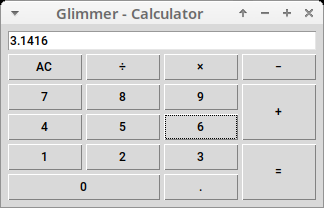
Y3network Ruby UI
https://github.com/ancorgs/y3network-ruby-ui
Circule
Generate an icon of overlapping circles derived from a hash.
https://gitlab.com/fjc/circule
Process
Resources
Help
Issues
If you encounter issues that are not reported, discover missing features that are not mentioned in TODO.md, or think up better ways to use Tk than what is possible with Glimmer DSL for Tk, you may submit an issue or pull request on GitHub.
Chat
If you need live help, try to
Planned Features and Feature Suggestions
These features have been planned or suggested. You might see them in a future version of Glimmer DSL for Tk. You are welcome to contribute more feature suggestions.
Change Log
Contributing
Contributors
- Andy Maleh (Founder)
- vin1antme
Click here to view contributor commits.
License
Copyright (c) 2020-2022 - Andy Maleh.
--
Built for Glimmer (DSL Framework).